Words are the enemy.
Look, don't think too much about it.

A slightly rambling post today, cobbled together from current experiences, old blog posts and long held beliefs.
It might seem perverse to say this, on a platform which is securely pivoted around writing, but in my opinion, there has been far too much written about photography throughout its history, the intensity is increasing and unfortunately I’m going to add another few hundred words here;
The other day I was looking through my photography book collection and reminding myself of the amazing work that has been produced over the last 200 years. One of the books I have on my bookshelf is a large book which shows a different photographer on each page, with a short written explanation about the chosen image at the top of the page.
I look through the images and enjoy them as visual poetry, but if I happen to read the ‘interpretation’ above it totally ruins the experience for me. I won’t name the writer as this is not a personal attack on him. The writer is well respected for his writing, but for me he was looking at the pictures and interpreting them without any photographic understanding. His is an approach of finding meaning, or allegorical references in everything that he sees. I have never met a photographer who makes images this way in 45 years of being involved in the medium.
The authors lack of visual awareness is revealed in many of his interpretations of the images.
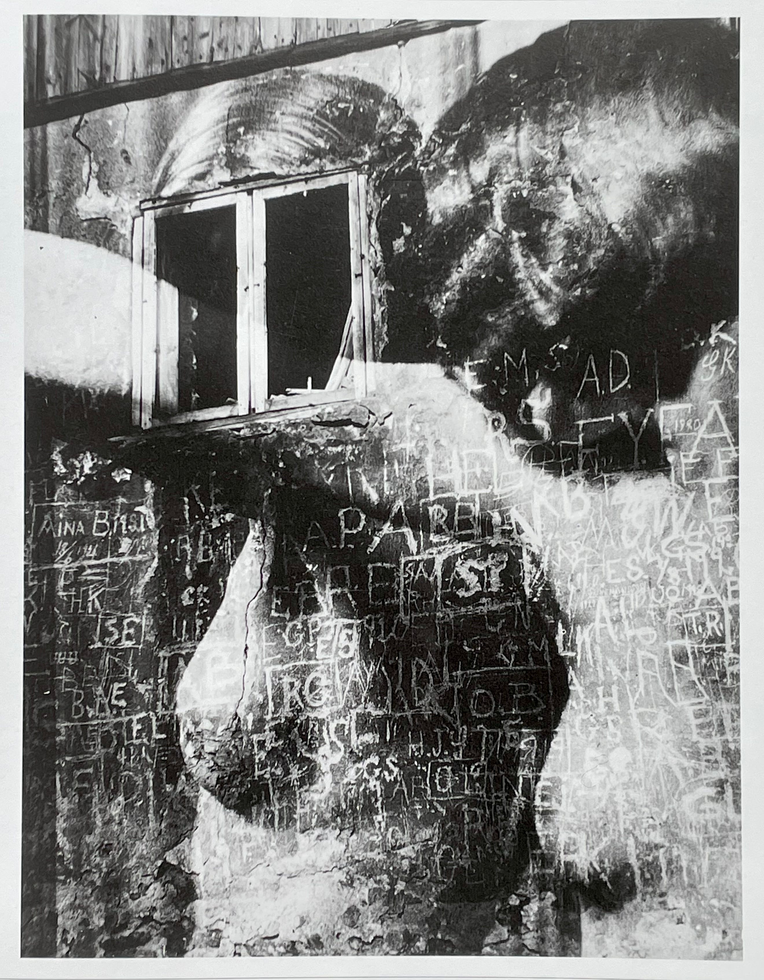
Harjek-Halke
If you study this image for a while you will see an old wall, painted a dark colour, with words, initials and names scratched into the plaster. The photographer has combined this with a picture of a nude woman with her arm pressed against a mirror. The author gives us this: ‘ This picture which is one of several related to the theme of the home of the sailors, is difficult to make out, and may have been printed from three or four negatives; each one for the wall, the initials and the nudes’.
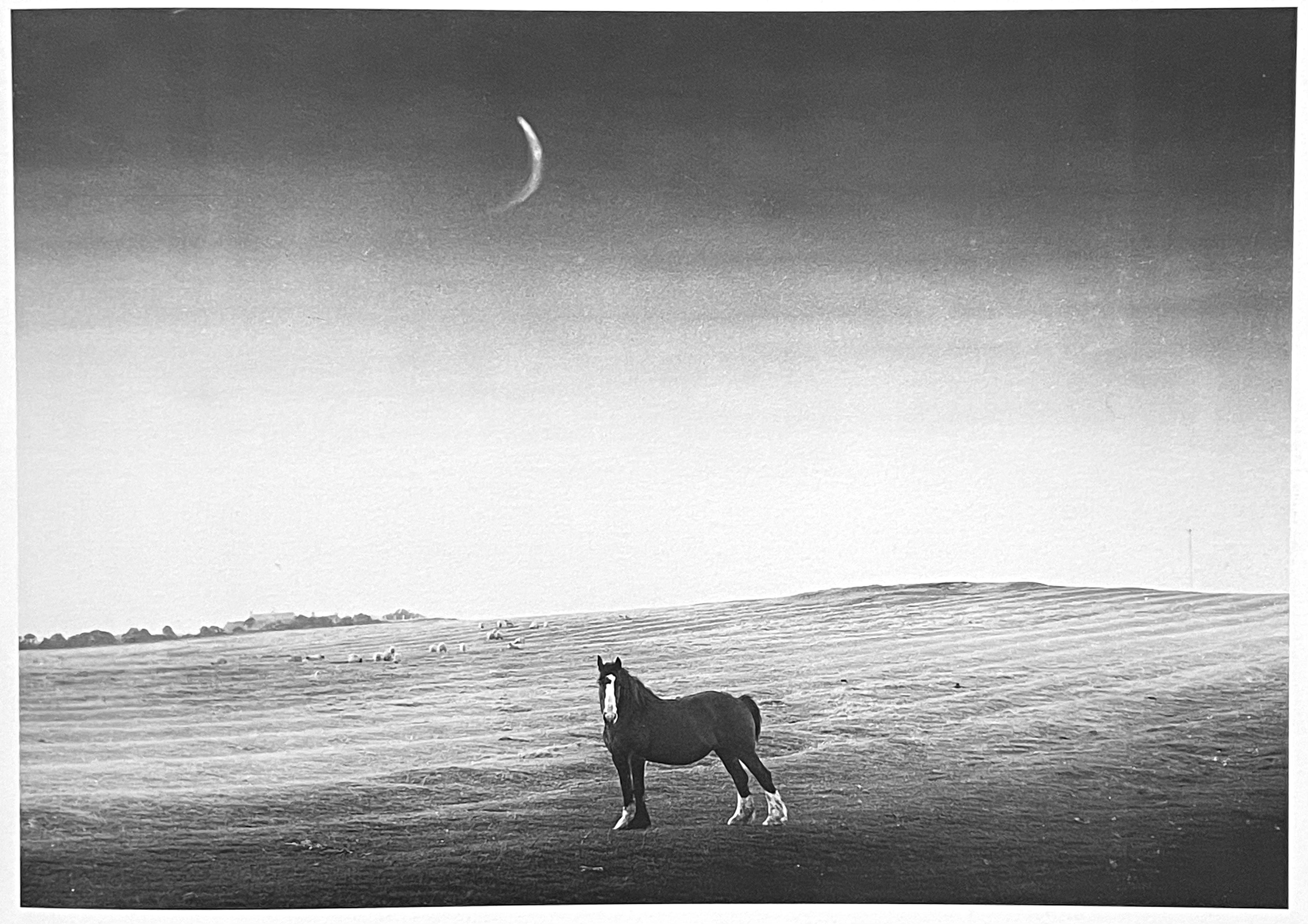
Edwin Smith
In this simple landscape by Edwin Smith, the author states; ‘This photograph may look like a fragment of agricultural landscape, but it contains elements symbolic of the culture and of traditional cultures everywhere, such as the horse and the moon and the field’. He has totally missed the fact that the moon has been clumsily drawn on the negative, making it a poor attempt at pictorialism. Edwin Smith did some wonderful pictures, this is not one of them.
I know from many years experience that people look at photographs in different ways, and very often, differently from how the photographer intended and that is fair enough. Many people are not visually aware and have no way of experiencing the image other than ‘what is it of?’ or ‘What is it about?’, they have to find a story, or a message in the picture. This is fine, if the picture works in that way, but some pictures work like a passage of music, they are a thing of beauty in themselves.
When I say they are a thing of beauty, I don’t mean that they are ‘pretty’ images, -they can be abstract, observational, personal, -or even lucky happenstance, but the common denominator is that they can’t be explained. If photographs have to be written about, then they should be chosen and written about by photographers, not by people with no visual awareness.
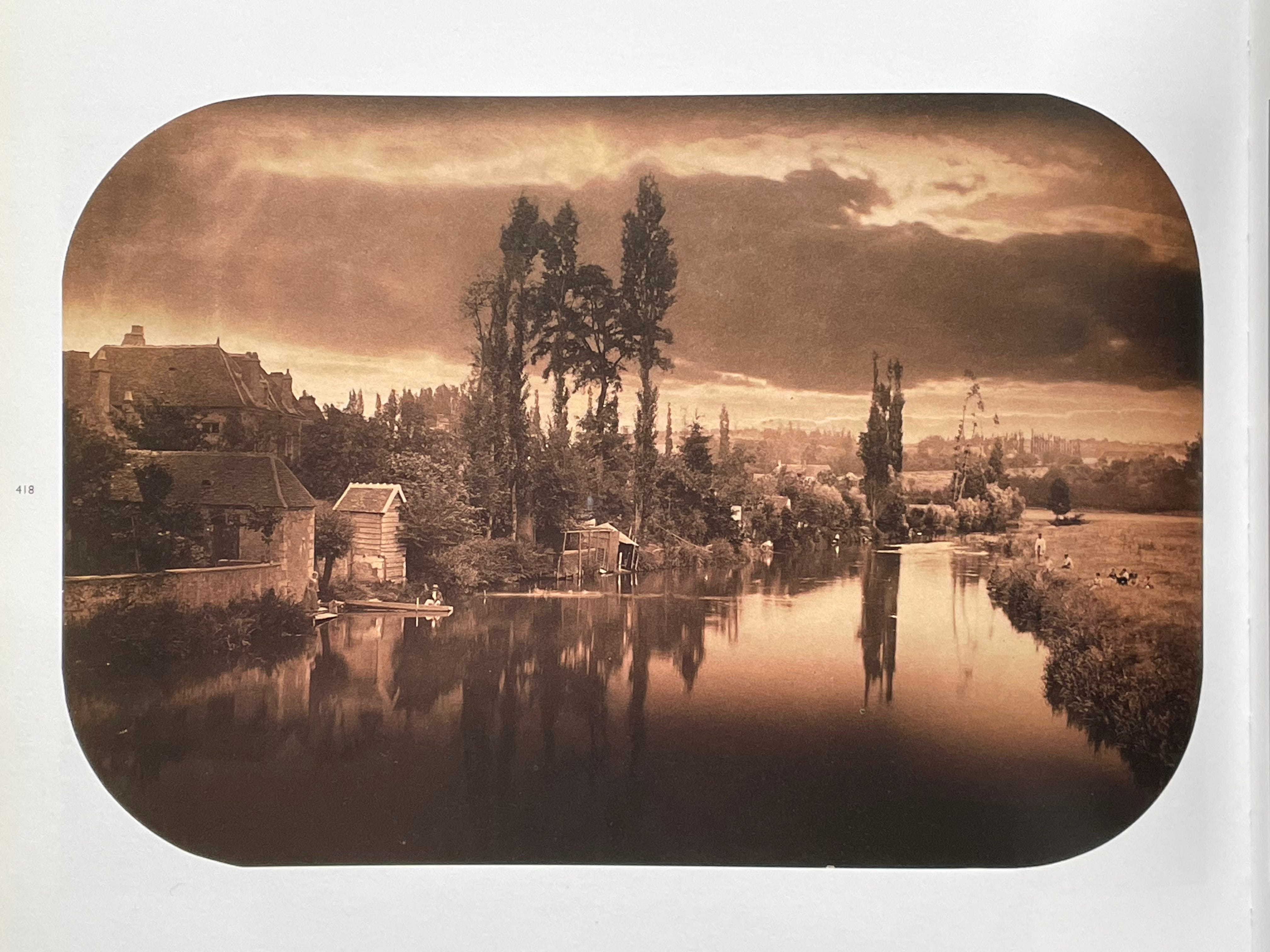
Camile Silvy
This beautiful landscape image was taken in 1858 and has all of the elements of a good landscape painting. The photographer understood composition and how to control light, with certain areas darkened down to draw attention to the important parts of the composition. The authors words are: ‘Silvy’s scene suggests a narration in moral terms, involving danger and assurance’. -Really?
Sometimes I can listen to a passage of music and be totally transported to a trance-like state. It does not matter what the song is about, or what genre it fits into, it just affects me in a way I can’t explain.
If you have a particular piece of music in which you can completely lose yourself, your enjoyment of it would not be enhanced by a ‘curator’ telling you what their interpretation of it was, especially if you read the interpretation and thought that they had totally missed the point.
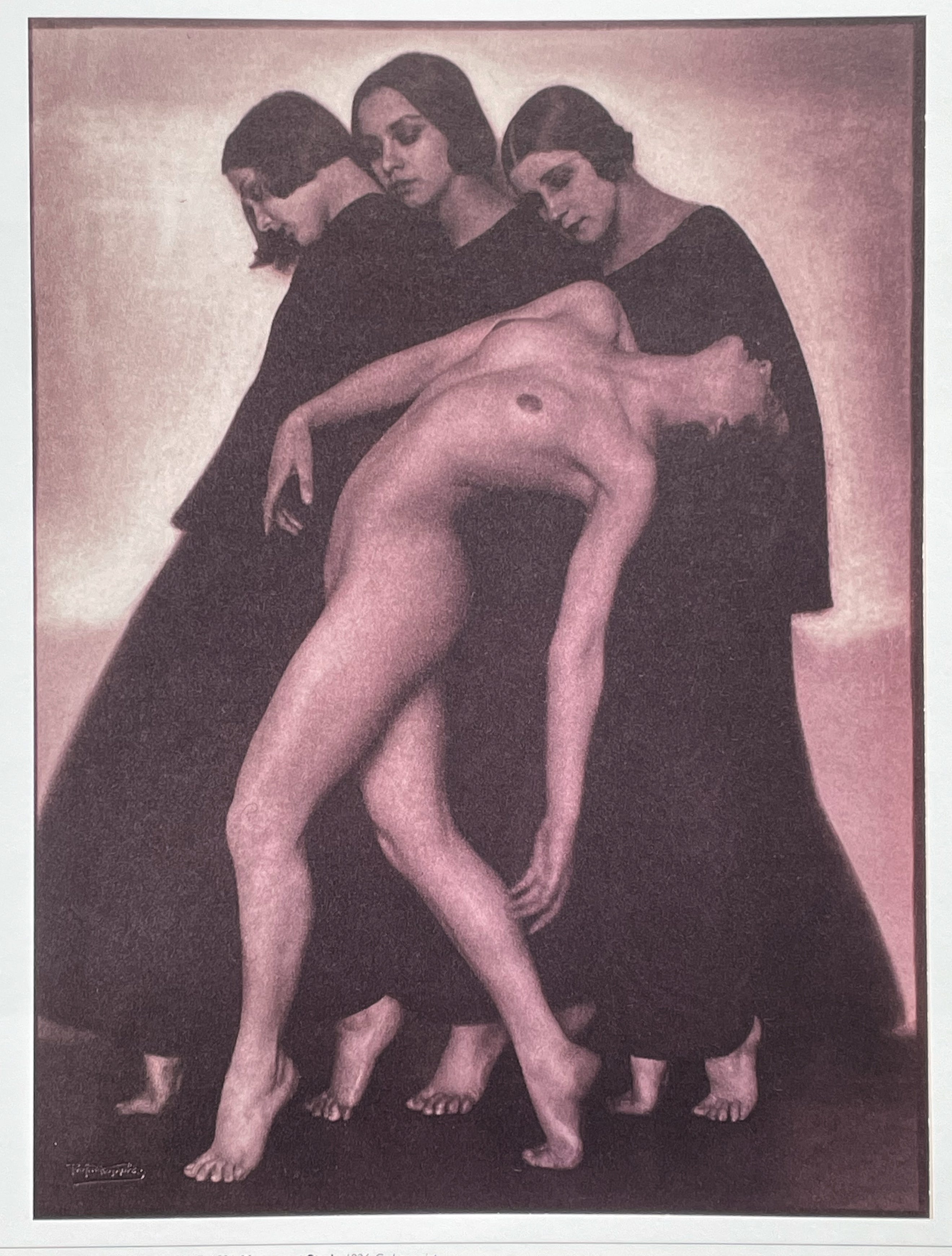
Rudolph Koppitz.
In this utterly sublime picture of four women, Koppitz has shown us youth, beauty, grace, form and suggested movement. It is lit beautifully and printed beautifully, but to the author: ‘The naked dancer may in some way represent death, or even a fatal movement. She gives the impression of having been struck down as she was advancing. Either that, or she is on the point of coming back to life. Her three attendants too, seem to be rehearsing either a revival or a loss of consciousness’.
Images, not words.
As a practicing photographer I am concerned with staying as ‘visual’ as I can be, for as much of the day as is possible. Modern life dictates that we deal with many distractions, and much of this involves paperwork or computers. All of this uses a different part of the brain and not the part you need to make good pictures. It logically follows then that banishing words from your mind when you are working visually is beneficial, if you can do it. Thinking in words detracts from the visual part of the brain, you can’t intellectualise before taking a picture. You can plan it, execute it as well as possible, but there will be things in that image that you only realise a long time later.
I have touched on this before in a previous article, I think there is too much emphasis on writing about photography, rather than the visual experience.
It is all to easy for critics to get verbose and self important, often missing the true spirit or intent of a piece of art. I will finish with an old joke that sums this up perfectly;
At the National Art Gallery in Dublin, a husband and wife were staring at a portrait that had them completely confused. The painting depicted three black men totally naked, sitting on a bench.
Two of the figures had black penises, but the one in the middle had a pink penis. The curator of the gallery realized that they were having trouble interpreting the painting and offered his personal assessment.
He went on for over half an hour explaining how it depicted the sexual emasculation of African Americans in a predominately white patriarchal society . “In fact”, he pointed out, “some serious critics believe that the pink penis also reflects the cultural and sociological oppression experienced by gay men in contemporary society”.
After the curator left, an Irishman approached the couple and said, “Would you like to know what the painting is really about?”
“Now why would you claim to be more of an expert than the curator of the gallery”, asked the couple?
“Because I am the artist, who painted the picture”, he replied, “In fact, there are no African Americans depicted at all.
They’re just three Irish coal miners. The guy in the middle went home for lunch”.
I don’t really know if I have a point to all this, I just had it circulating in my head and thought I ought to write it down. Let me know your thoughts on the things I’ve touched upon please.
If you find my articles interesting or useful, please spread the word to anyone you can think of who would be interested.
If you have enjoyed this post and the information here and elsewhere on my Substack and you would like to support me, you can subscribe or just buy me a coffee at Ko-fi.com/andrewsandersonphotography You can send as little as £5.00, or more if you are feeling generous. This money goes towards materials used for the tests and printing for these articles. Alternatively you can be a paid subscriber.
Thank you for reading, please let me know your thoughts.
Andrew Sanderson May 2026.
Other places to see my work;
Instagram; http://instagram.com/andrewsandersonphotography
Original hand made darkroom prints are available from my online shop; www.andrewsandersonphotography.bigcartel.com
I also offer one to one workshops at my darkroom/studio in West Yorkshire, UK. If you are interested please email me at sandyjottings@icloud.com
when it comes to my photos i always say this: one can see what they want and understand what they can.
I agree with much of what you've written here - the importance of visual literacy and the need to allow pictures to do their own work. It reminds me of Philip Perkis' ideas about what gets rewarded in culture: words and numbers. There is no reward for a young person who is visually sensitive. However, I am troubled by the idea that words and photographs are (or should be) unconnected. I've noticed a tendency on Substack to present photographs as somehow beyond critique. A kind of common sense view of photos. What you see is what you get. There's a parallel tendency to see photographs as stories (narratives) that I also find problematic. And then also the idea of photographs as the outcome of certain craft-based techniques and processes. Whilst I'm all for celebrating visual intelligence or acuity and the notion of visual thinking (without words), I don't think this means rejecting the importance of interpretation. Photographs are wild and indeterminate, to borrow David Campany's language. Their radical openness means that they go on accumulating meanings over time. I am very grateful to the many excellent writers on and curators of photography that I have encountered over the years. They have helped me reflect on my own thoughts and feelings about photography. Words can help us think about images, and vice versa. Words aren't the "enemy", apart from the two words "Nigel Farage".