Lith printing.
A printing method with a unique look.

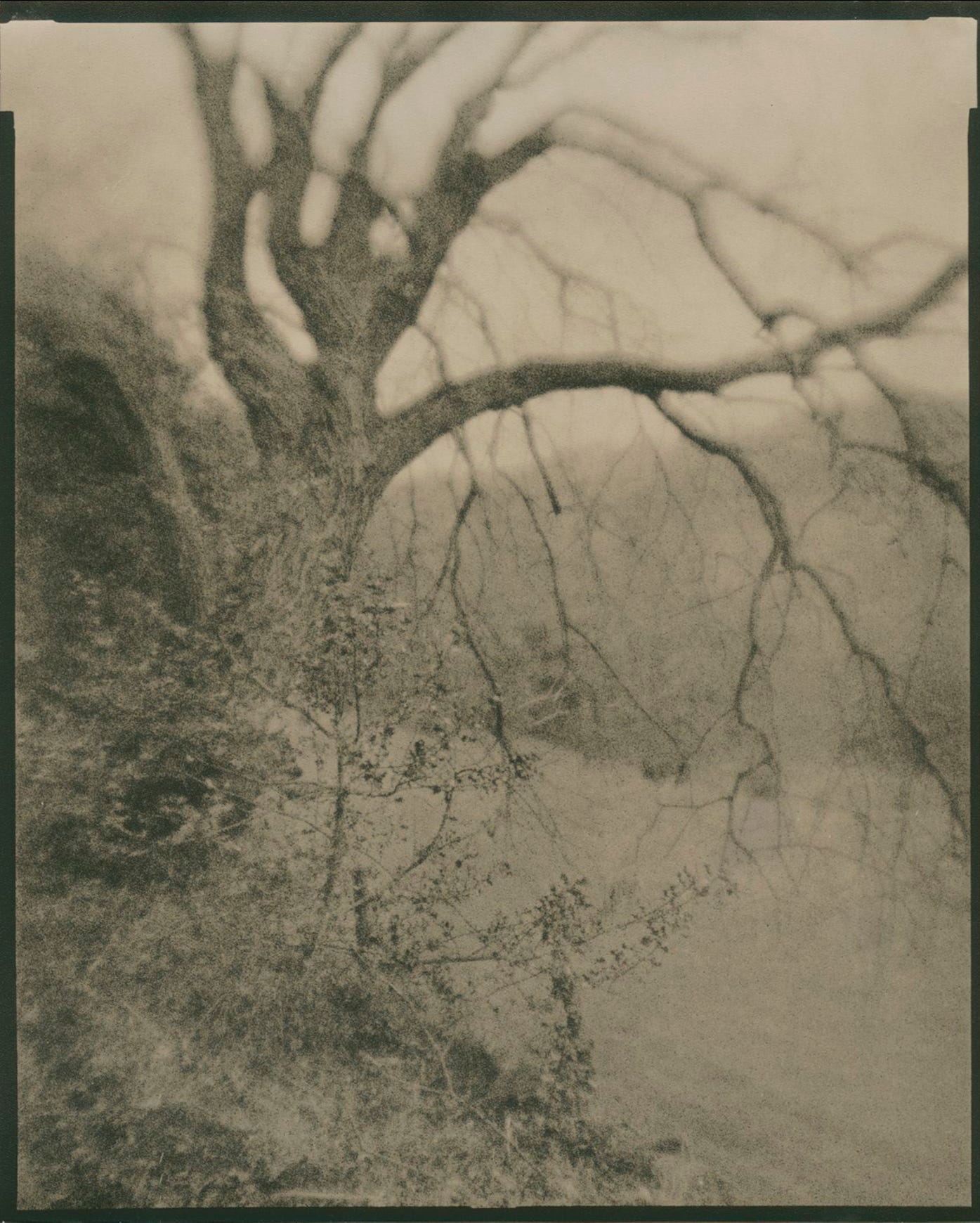
I had a visit from a friend the other day while I was doing some contact printing. He was asking me how a real Lith print looked, as he had only ever seen them in books. I told him that there wasn’t much to it, the technique is pretty straightforward if you are just playing around with it, the difficulty comes in trying to get repeatable results. His question made me remember how much I used to enjoy that particular type of printing, so I decided a demonstration would be the easiest way to let him see just what it was capable of.
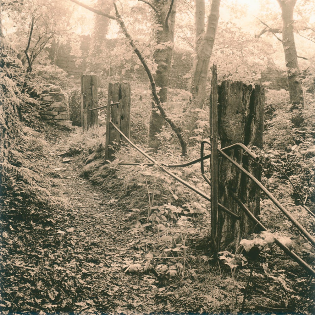
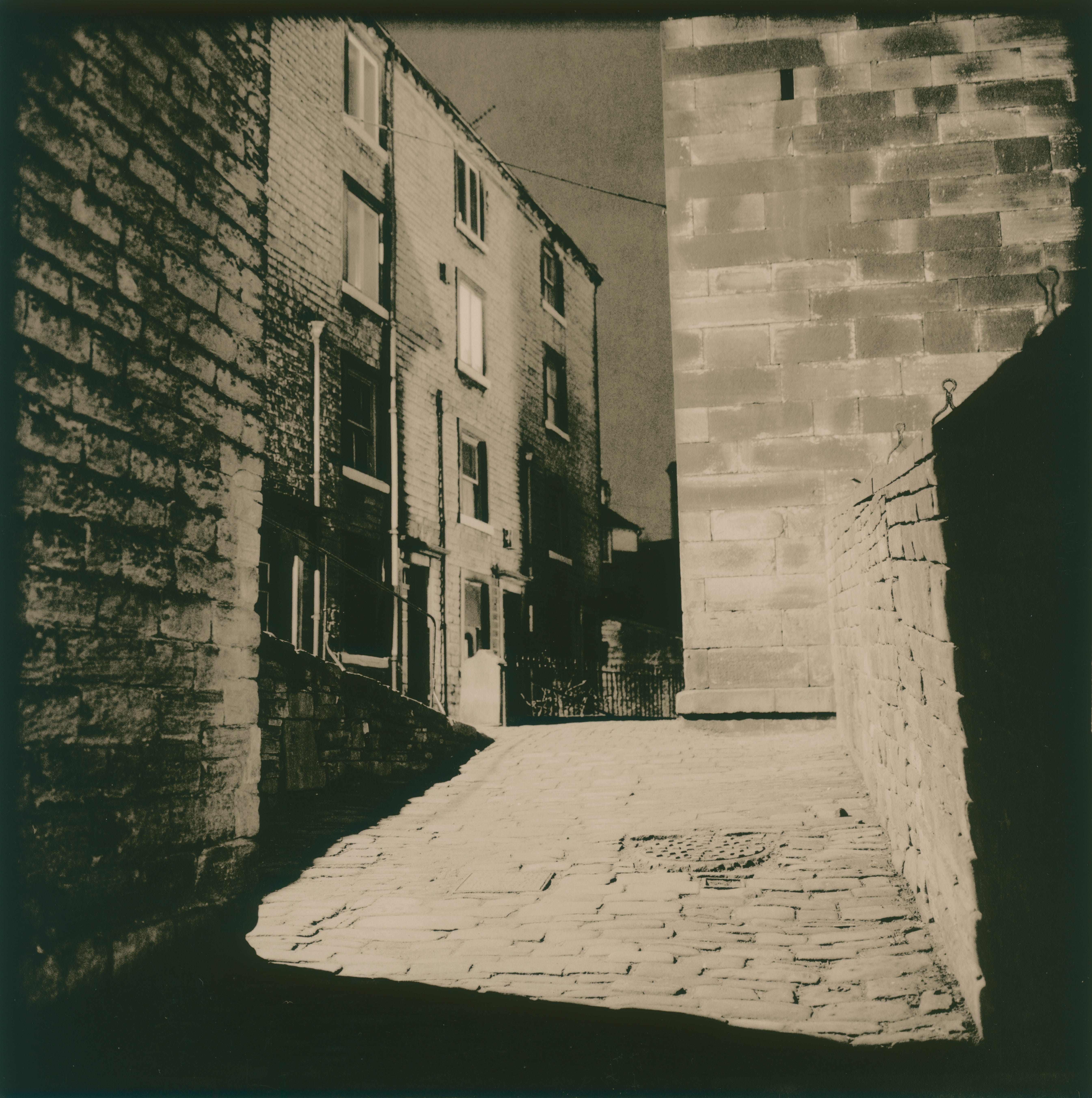
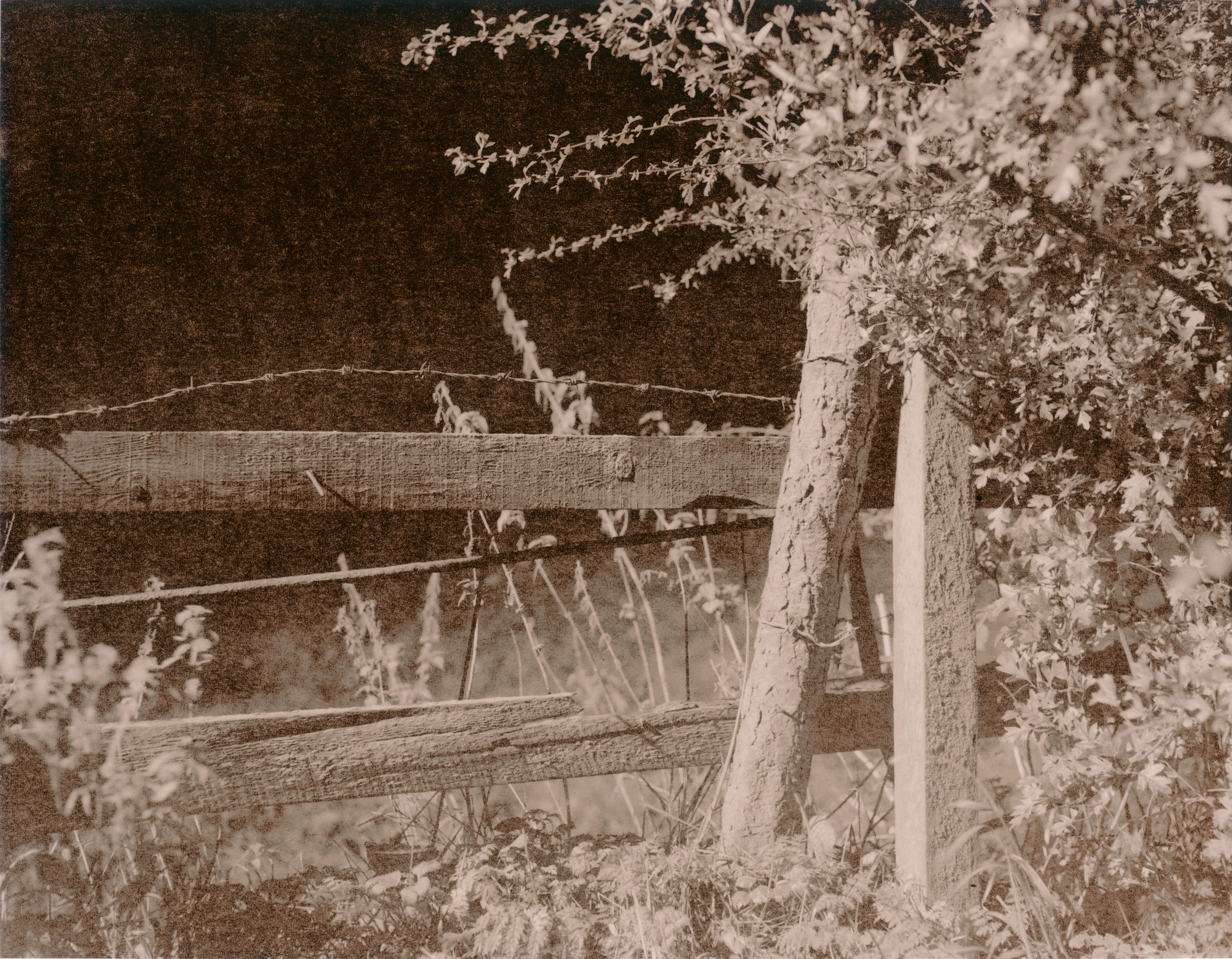
I wasn’t that bothered about doing contact sheets that night, so I mixed up some old Kodalith dev which I’ve had for over twenty years (it seems to last forever) and chose a suitable neg. I couldn’t find any proper Lith paper, but remembered that old Kentmere Kentona worked well and Ilford Warmtone FB could be used too. The Kentona gives a very pink/sepia result which is very typical of some Lith prints, but I’m not crazy about it.
Ilford Warmtone produces a Lith type image, but isn’t ideal, it’s not really supposed to be a ‘lithable’ paper, the split isn’t as pronounced as with some other papers and you don’t get any pink tones. The image goes speckled in a nice way though and takes on a khaki sort of colour which I find attractive for certain images.
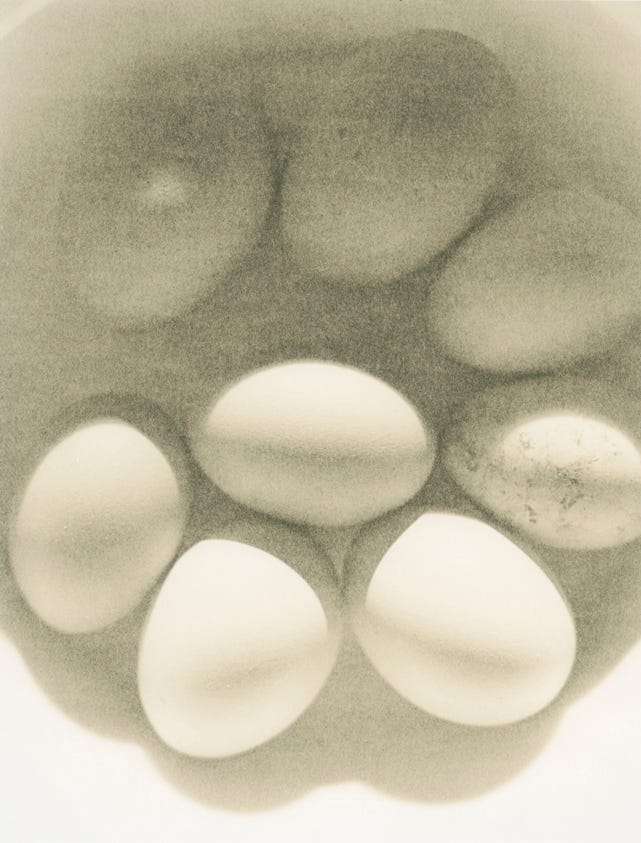
Towards the end of the printing session, when the developer is a bit exhausted it can give gritty, grainy looking prints. This is known as ‘Pepper fogging’ The effect is often so grainy looking that it can’t be used for large format negs unless you particularly want them to look like they were shot on Delta 3200 on a half frame camera.
Old Agfa fibre based paper usually works very well if you can find any. Portriga, Record Rapid, or Agfa Multicontrast Classic are all excellent. One important point though, the RC version definitely doesn’t work, -you have to use the FB.
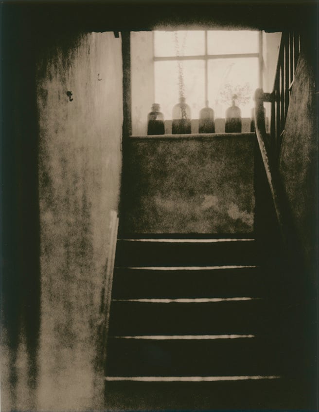
The printing session; Once we had a few prints I began to experiment with a few other papers. I tried Ilford Gallerie and Kentmere Fineprint VC FG Warmtone, which has a lovely quality when processed normally, -I think it has the look of a pencil drawing with the right image, it doesn’t have a deep black, but a deep pencil grey on a cream base. I was surprised to find that it worked really well as a Lith paper. Out of the four non Lith papers I tried it was easily the best, I also tried a very old single weight bromide paper and was surprised to see that it worked very well, with a similar look to the kentmere Kentona paper.
The Technique;
I was using the Kodak lith developer, though I do have the Fotospeed version too. I have never done a side by side comparison, but they both work.
Working strength Lith developer is made from two concentrates. My own preference is to mix 50ml of A and 50ml of B into 900ml of water at 20C. The mixed up solution is only good for one printing session as it goes off quicker than normal paper dev.
Exposing the paper takes much longer than when a normal print is made, as the lith process is basically overexposure, followed by a heavily diluted developer that allows for a very gradual build up of density. I have two methods to establish the exposure time of a print;
Method A
I cut a sheet of 10×8 into four equal 5×4 test pieces, then I expose each piece of paper in turn under the same part of the negative. Each one has a different exposure – 1 minute, 2 minutes, 3 minutes and four minutes. I write the times on the back of each one. I start the clock, and drop them all in the developer together keeping them moving, but I try not be too vigorous with the agitation. I then look for the faint image, -usually around two minutes.
Somewhere between three and a half and six minutes, depending on paper type, the black will begin to appear in the deepest shadow areas. I need to keep a close eye on it at this stage, as the black areas will get darker and creep up the tonal range. When it has the desired shadow tone, I remove the test and drop it in the stop bath. I do the same for each of the other test pieces. making a note of the times they were removed from the developer -this is known as the snatch point.
I only examine the tests after they have been in the fix (Ilford Warmtone has a milky coating which is removed in the fix, making it difficult to accurately judge a proper black).
You will notice that the most contrasty one is the one with the shortest exposure and the longest development time (think of uprating film, -underexposure and overdevelopment mean more contrast). The one with the greatest exposure and shortest time will have the lowest contrast and may look rather ‘muddy’. One of the tests should have the tonality and contrast which is to your liking and this is your indicated exposure and dev time for the main print.
Method B
Mix up a tray of Ilford Multigrade developer in a second tray next to the Lith developer. Do a normal test strip in the usual way, eg; 5 second increments.
Develop this in the Multigrade developer and choose the exposure which gives you the first appearance of black in those areas which were clear on the negative.
Multiply this exposure by 10.
Give the print this extended time and develop in the Lith developer. The mids and highs should appear around two minutes and the snatch point will be between three and a half minutes and six minutes. If the developer is fresh and at 20 C it won’t take too long, but as the solution ages, dev times can become really long. I have made lith prints that took half an hour!
Warmtone FB papers vary in their response to Lith developer and the 10x rule is only a guide, I know it works for the Kentmere papers mentioned above, and for Ilford Gallerie, but the Warmtone FB needs only about 5x extra exposure.
Whichever paper you decide to use, remember that the exposure can vary tremendously and still ‘work’ depending on the effect you are after. Overexposure lessens contrast and underexposure increases it, -but you may have very long dev times. Because of the excessive exposure needed compared to conventional printing, dense, overexposed or over processed negatives are to be avoided. Choose negs which are normal to thin.
Consistency.
There are so many variables in Lith printing that it is very difficult to get two that look exactly alike. If you expose two or three pieces of paper and put them through one after the other you will have pretty similar prints, but if you were to do three prints over an hour they would each be different.
The developer oxidises quite quickly compared to other developers and the temperature can drop (a problem in the winter months in the UK). Lith developer is sensitive to temperature changes, so a heating device under the tray is a good way to lessen this.
When the developer has oxidised it creates ‘pepper fogging’ which looks like exaggerated film grain.
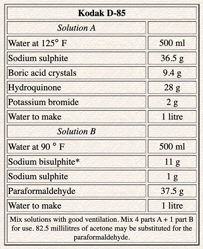
If you have tried lith printing in the past you will know how interesting it can be. If you haven’t then I urge you to give it a try. A few different developers are still available. Moersch Lith 5, Rollei, Kodak Kodalith and Fotospeed LD20 are available online, or you can make up your own from the following formula;
I don’t use the lith process often, as I like to keep it special and not get bored of it, but it has been a while since I did some serious lith printing. I have some recent negatives that I think will really suit it, so I’m hoping to have time to make them this week.
If you find my articles interesting or useful, please spread the word to anyone you can think of who would be interested.
If you have enjoyed this post and the information here and elsewhere on my Substack and you would like to support me, you can subscribe or just buy me a coffee at Ko-fi.com/andrewsandersonphotography You can send as little as £3.00, or more if you are feeling generous. This money goes towards materials used for the tests and printing for these articles. Alternatively you can be a paid subscriber.
Thank you for reading, please let me know your thoughts.
Andrew Sanderson October 2025
I learned to love lith printing though it took a while. I then started collecting old paper. Oriental Seagull is a favorite. I found burning and dodging really helped getting a more even exposure. Microwaving developer saved a lot of time.
I love that print from Method A, the blacks are so dense!