Hand Colouring.
Painting by numbers?

Ever had the urge to colour in one of your black and white images? In the days of high-tech colour why would you spend time hand colouring a monochrome print? The answer is in the unique look this age-old method can give to an image – and you can use anything from oil paints to felt tip pens to achieve the effect.
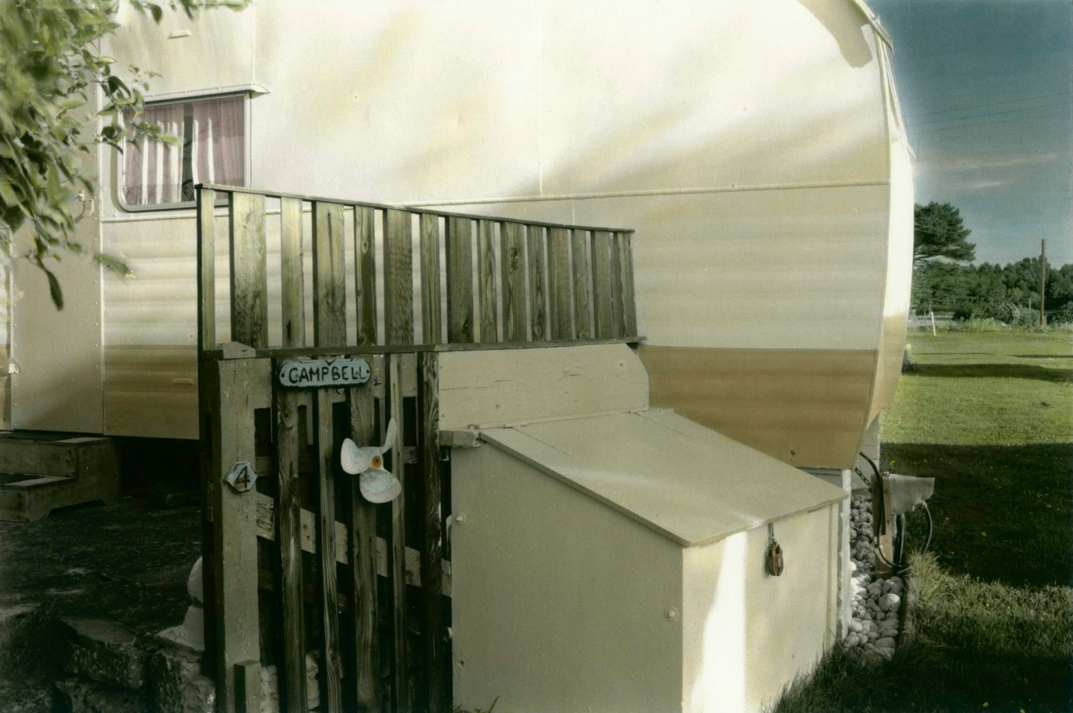
Hand colouring is as old as photography and has evolved alongside it. For the photographer working today, adding colour by hand is an aesthetic consideration, but back in the very early days of photography it was a cheap and useful way to get a colour image. The principle of colour photography had been demonstrated as early as 1861, but was not until 1869 with the invention of the trichrome process that a practical method emerged. At that stage it was not widely available and the process needed special equipment and a fair degree of skill. Hand colouring offered a simple alternative.
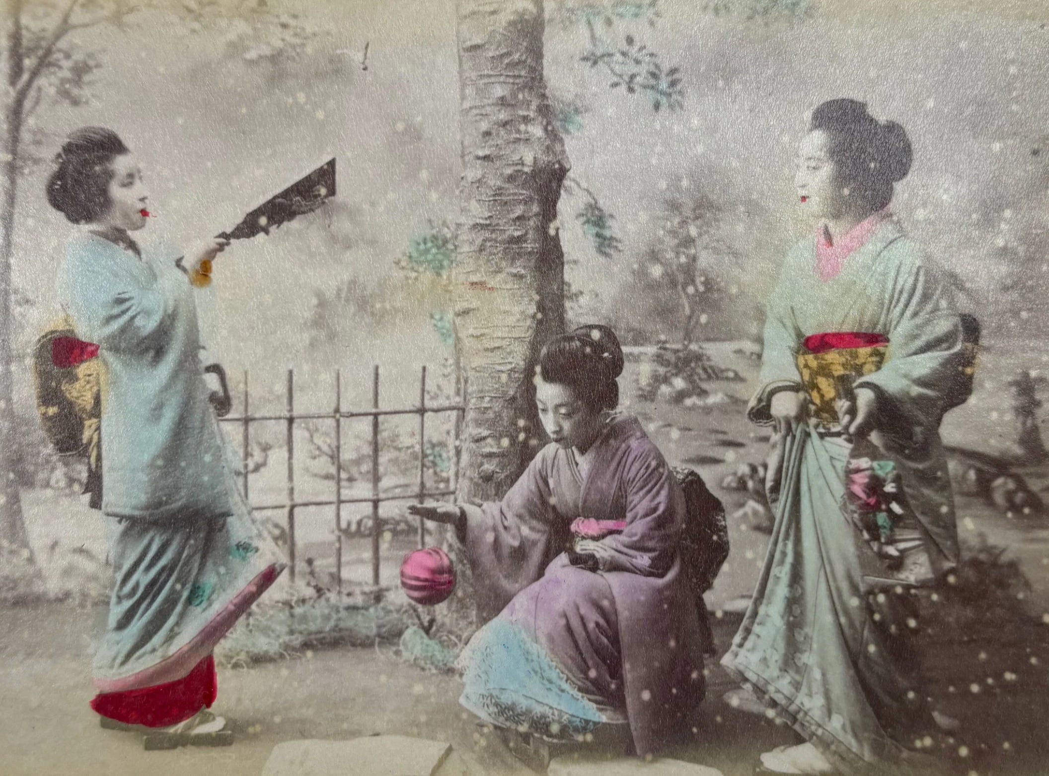
Early hand colouring often looked nothing like a real colour image as we would know it today. Photographers of the late 19th and early 20th century were striving for realism, though few managed to achieve it. This was largely due to the fact that they had only the traditions of painting as a reference, whereas the contemporary photographer has the considerable advantage of knowing what a correct colour print looks like.
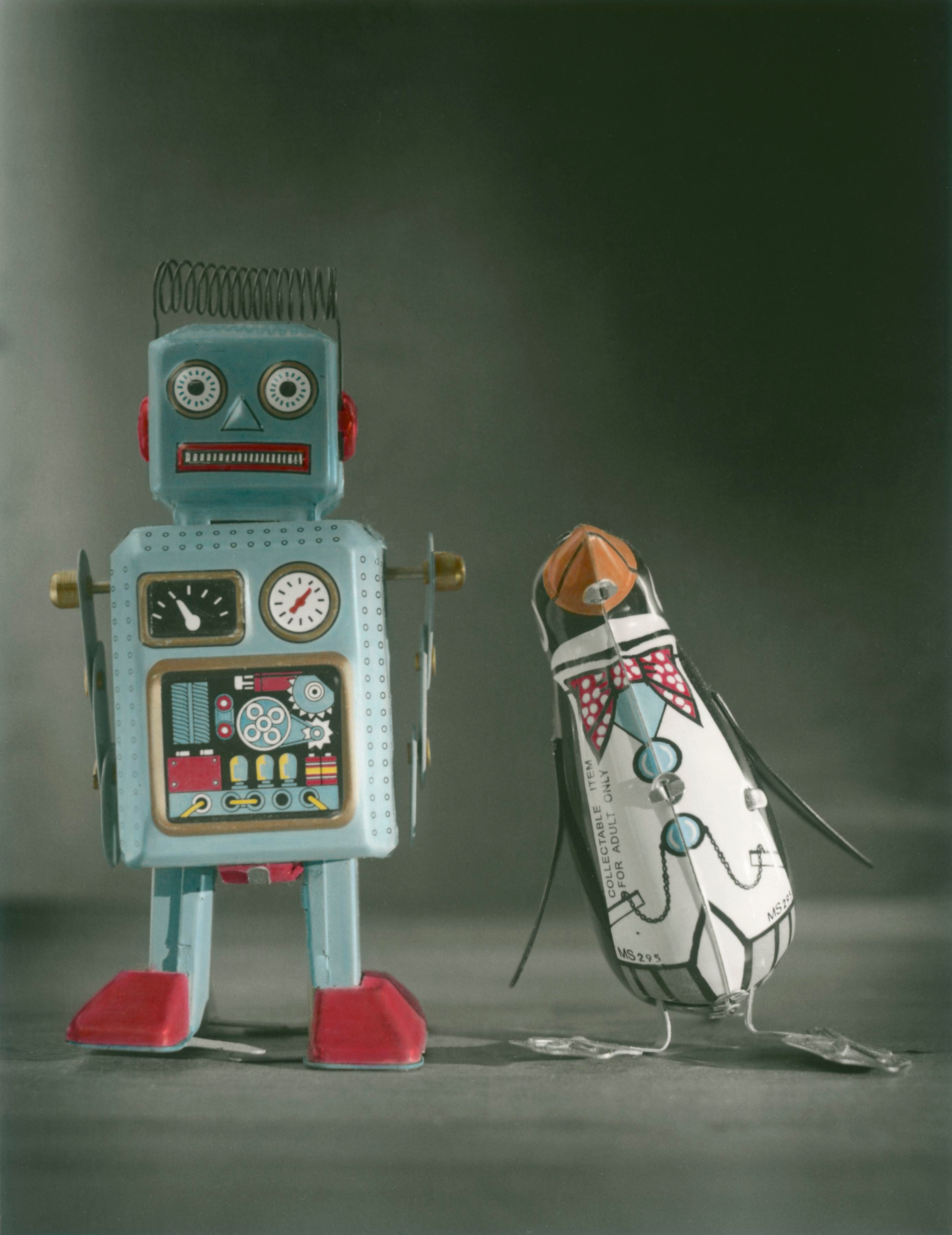
Nowadays however, realism is rarely the aim of hand colouring. Why bother trying to fool people into thinking that they are viewing a colour print? It’s much easier to shoot colour film or digital.
Today, hand colouring can be enjoyed purely for its visual effect. Colourists usually want people to see evidence of their hard work or artistic ability, so they prefer to leave some clue to inform the viewer that they are looking at a hand coloured print. Some prefer pale, muted colours, some choose false colours, and some may choose stronger, more accurate colouring, but with areas left uncoloured.
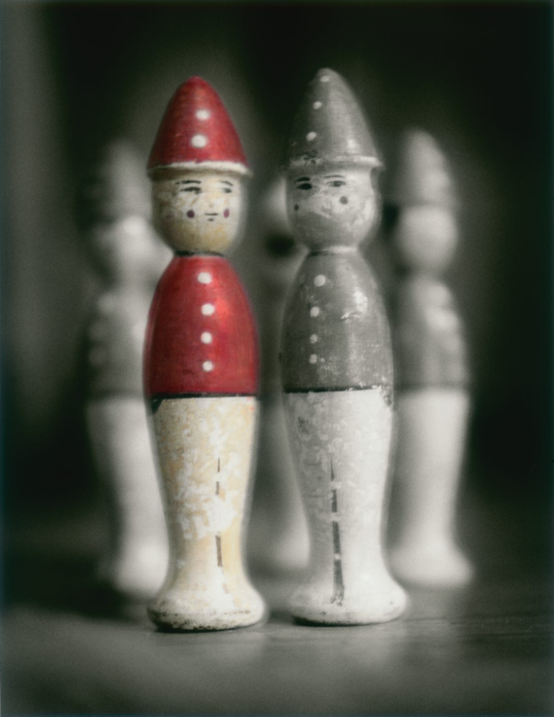
The popularity of hand colouring has had a fluctuating past, from the early days of photography, through the postcard boom of the first quarter of the 20th century and the cheesy posters of the eighties. At other times it has fallen out of favour and become unfashionable. I think it is enjoying another revival, perhaps as a demonstration of a photographers artistic merit in a world of easy, automated digital imagery and latterly the horror show that is AI.
I first began hand colouring black & white prints in the late 1970s, as I was dissatisfied with the fluffy, washed out look of commercial colour prints I was getting at that time. Also, the rich, deep blacks of a fibre based print were far more evocative and moody than the blueish black of a colour RC print. I wanted depth, detail and accurate colour, so adding dyes to a well printed black & white fibre based print from a medium or large format negative seemed like the ideal solution. My first pictures were understandably heavy handed, but I soon worked out that I needed to build up the colour gradually and to be slow, careful and methodical.
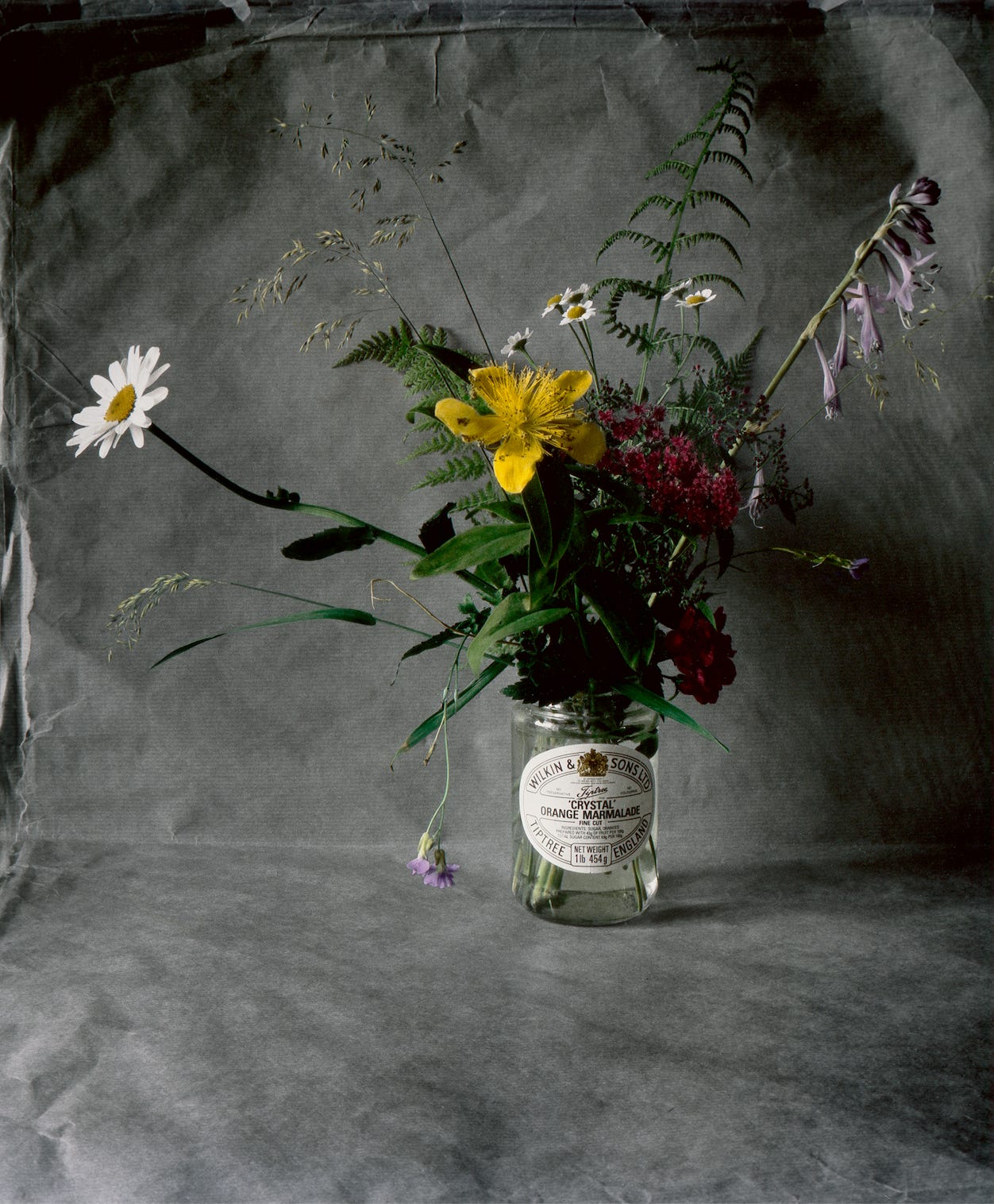
There are various colouring methods available today; from dyes, photo oils and pencils, through to felt tipped pens and even food colouring. In fact, anything goes, providing that it achieves the desired effect. The final result will differ, and colour permanence can be an issue with some of these.
Which method should you use? Well, factors such as ease of use, permanence, or just personal taste might dictate your choice, so I will attempt to explain the advantages and disadvantages of each method as I see them.
Options;
DYES.
Traditionally, dyes were most frequently used for colouring photographs and it is easy to see why. Of the various colouring methods, dyes are the most easily controlled and because they are absorbed by the print, they allow the silver image to show through and do not impair its luminosity. Properly applied colour can increase the impression of depth and impart a three dimensional quality. However, while colour added does not necessarily have to be true to the original hues in the scene, it does benefit from having a similar depth and intensity.
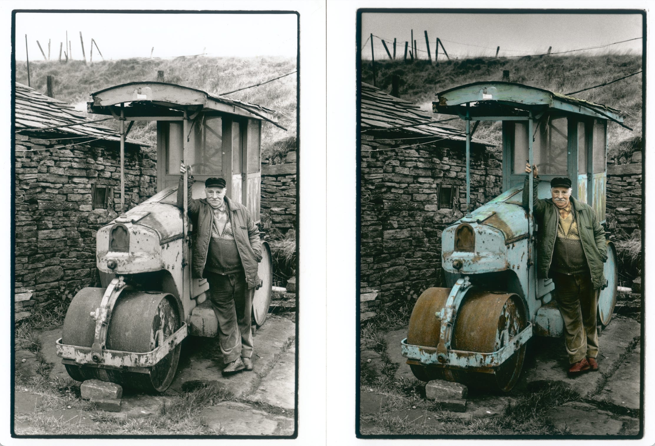
The only drawback to dyes is the poor lightfastness of the colours. I have had prints framed and on the wall and lost most of the colour in just three years! If the prints are stored in the dark and kept dry, they should last many years, though it is a shame to spend so much time on a picture and then to have to hide it away.
OILS.
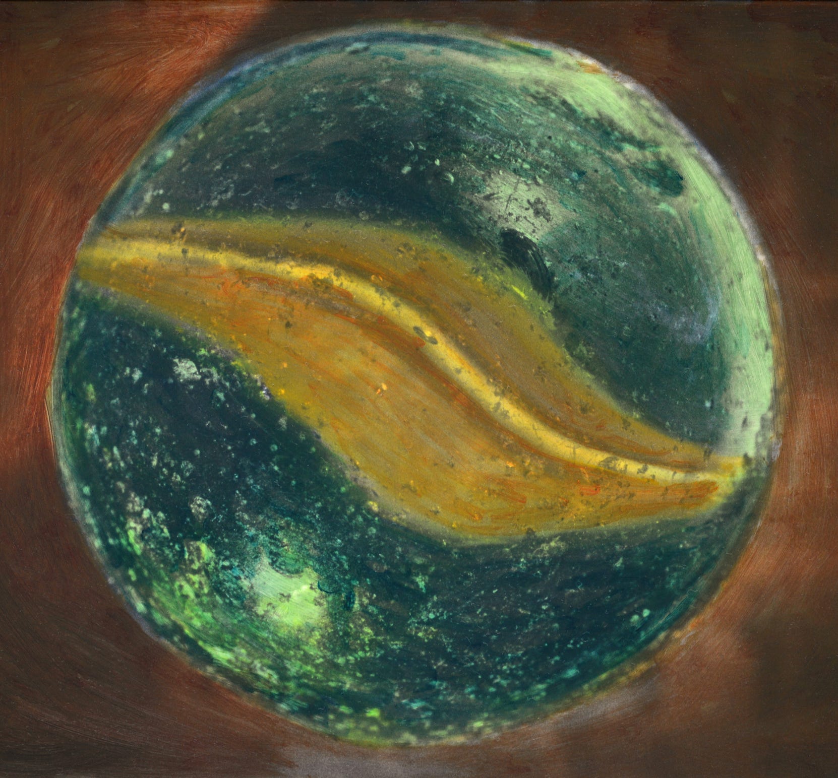
Oil paint is a colouring method that is rather more popular in the USA than here in the UK. The effect it gives is quite different from dyes, since the paint can lie on the surface of the print instead of being absorbed if the wrong paints are used. With opaque colours, detail in the print can easily be obscured, so transparent colours must be chosen. Fine detail is much harder to achieve with this method, as it is usually applied with cotton wool swabs or cotton buds, though I have had some success with fine brushes, mainly on textured matt papers. On the plus side, oil paints are extremely long lasting and resistant to fading. Matt and textured papers are best for working with oils.
PENCILS.
Coloured pencils will only work with semi matt or matt papers, glossy prints cannot be used. Colour added by pencils also lies on the surface of the print and so can obscure detail, but sometimes this can look quite interesting and can bring a particular sketched effect, on textured papers such as the old Kentmere art document or Ilford Art 300, which cannot be achieved by any other means. Pencils are very easy to apply and are the least messy of the methods described here. If you don’t feel confident about handling a brush, then start with this technique. Another advantage of using pencils is that there is no mixing required and the colour can be applied over a period of time. There will be no colour discrepancy if you return to the image some time later.
FELT PENS.
Unless you can source pens with pale colours, this will only give garish, strong, graphic colours. I have used felt pens directly on a print before, but never for anything more serious than a home made birthday card. If you like strong, streaky results then this is perhaps the technique for you!
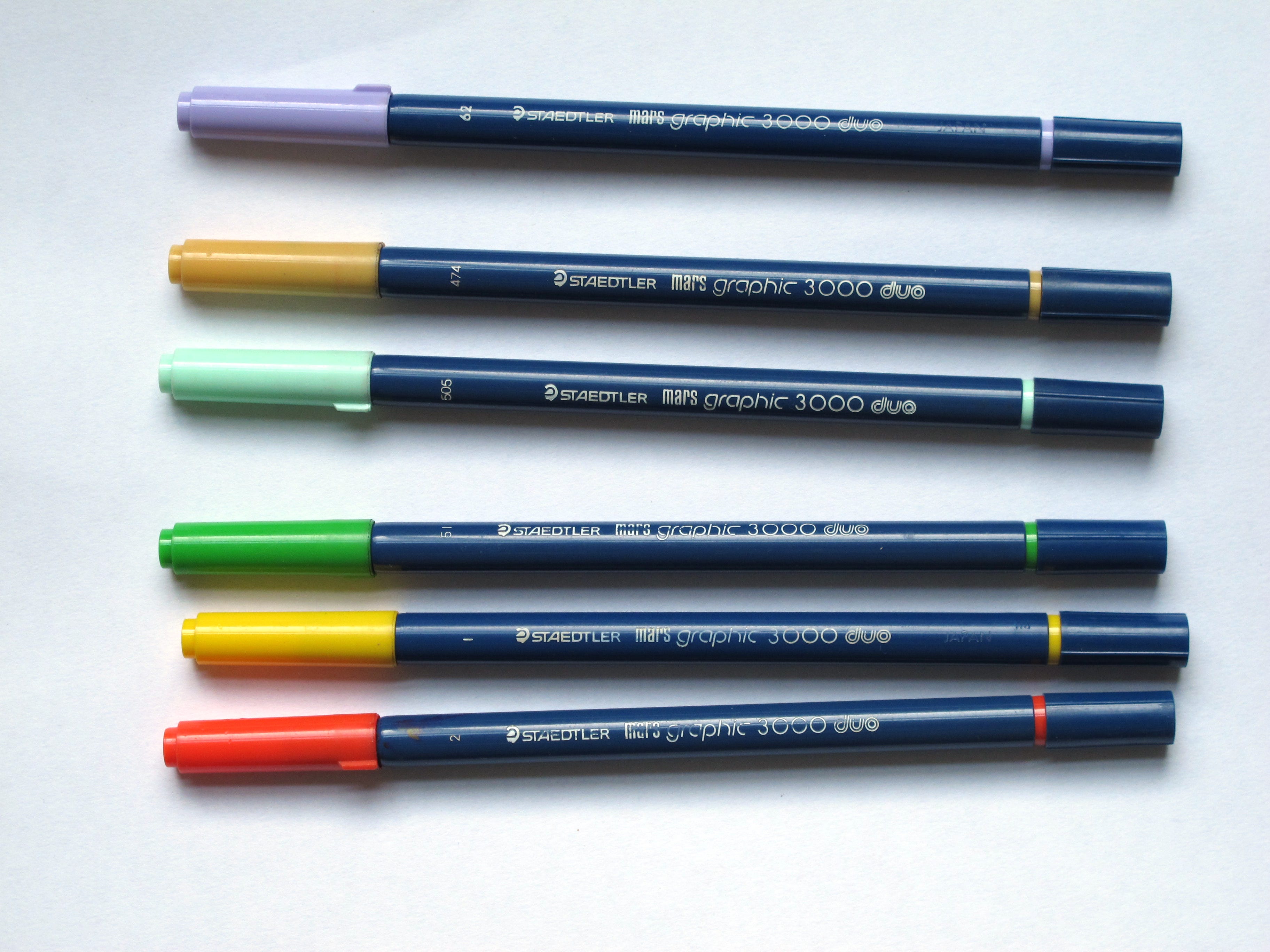
There used to be a type of ‘brush’ pen made by Staedtler, which had soft, rubbery tips, and they came in a range of pale and strong colours. These were great for colouring and I still use mine, but I dilute them with water and use a paint brush for greater control. I’m not sure if they are still made, but you may find some on the auction sites. They were called Staedtler Mars Graphic 3000 duo.
My technique/method
My preferred colouring method is dyes, with pencil added after if I am using textured matt papers. I begin by having my colour in a mixing dish diluted with water, with a paper towel close by for mopping up excess or splashes. I also have a paper towel on the part of the print where my hand will rest, this prevents greasy marks from my skin leaving marks on the paper – and I have something absorbent to move quickly into place, should there be an accidental blob of colour from the brush.
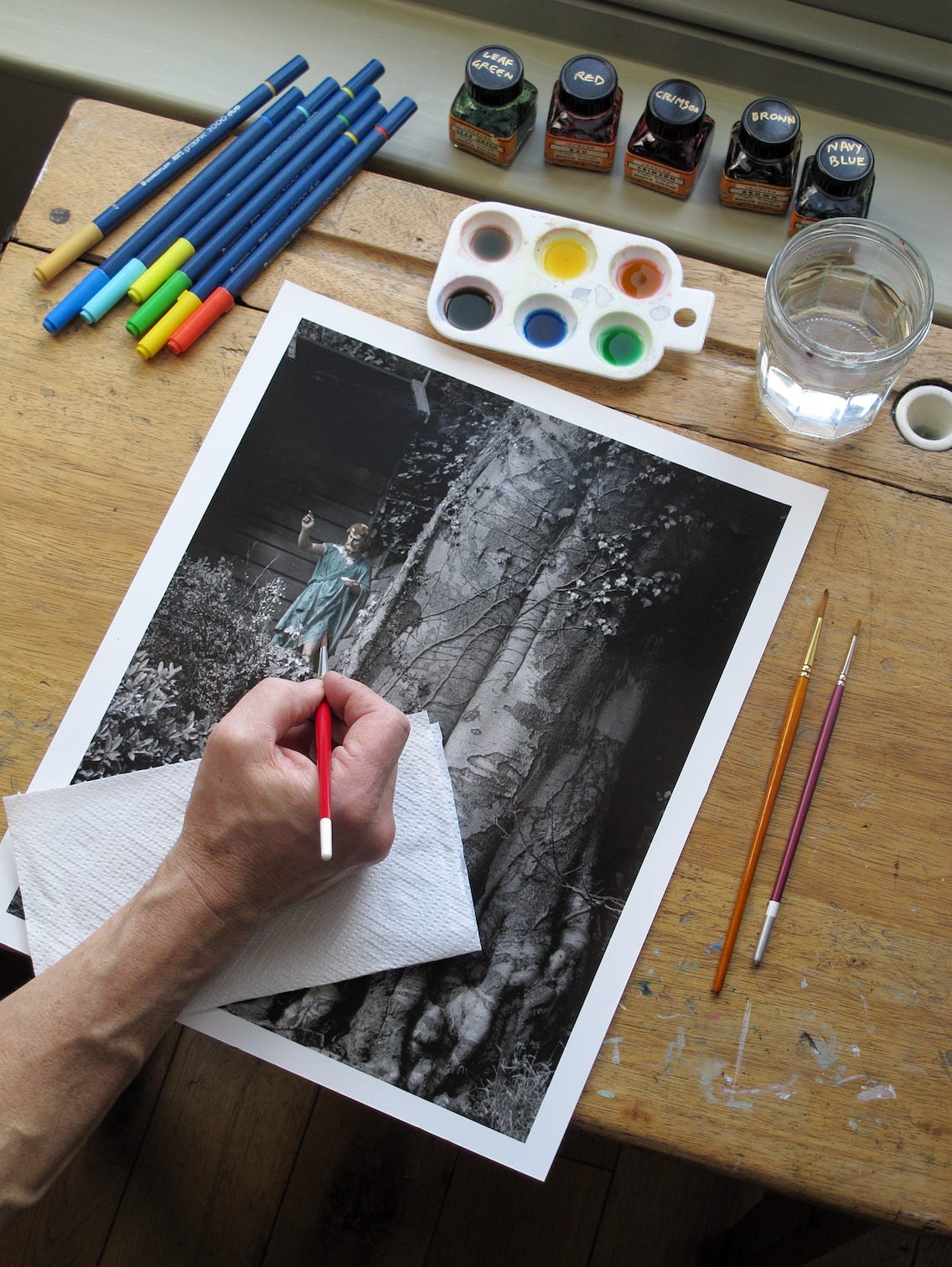
Before I apply any dye, I try it out on a scrap print with a similar tone to my intended picture, this way I can prevent staining from having the colour mixed too strong. I apply the colour to the print, making sure it is just strong enough to affect the mid tones with one stroke of the brush. Applying the colour gradually in this way allows much greater control. The precise colour to water ratio varies from colour to colour and obviously depends on what type of dyes you are using.
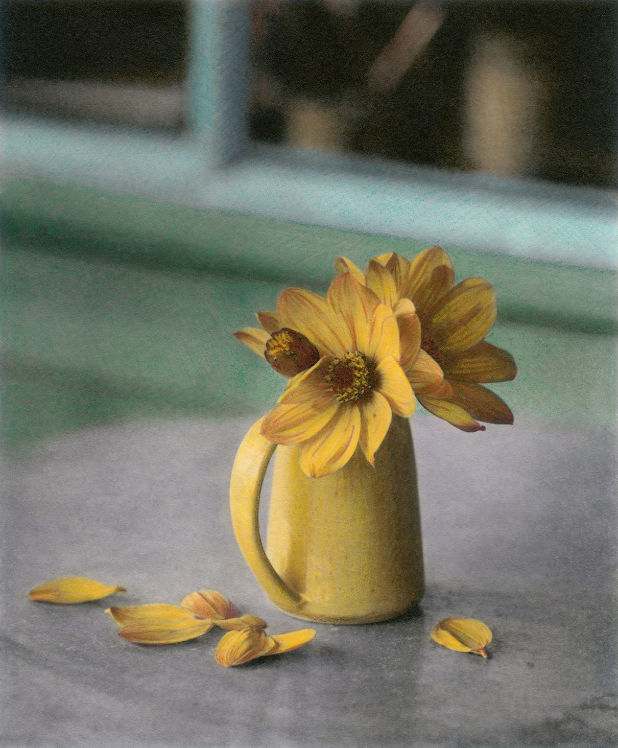
When I bring the brush to the print, I never touch a light area first if I can help it. I put the dye in a dark area and drag it to a lighter patch, or apply it in an unimportant part and then drag it over; this avoids any nasty surprises with colour streaking. The second layer of colour can be applied immediately; no need to wait for it to dry completely, the dyes will sink into the paper and will not be shifted by another application of watered down colour. I sometimes allow it to partially dry between coats as it allows me to see which area the colour is spreading to.
Many who try hand colouring for the first time are put off by their first results, usually because they have the colour too strong. Using the dyes as they come from the bottle gives a very intense colour, which will stain the print before it can be spread over the desired area. Dilute your dyes and build up the colour in layers to get a more even result. The hardest areas to colour are large flat areas of even or subtle colour, such as skin, or large expanses of sky.
Recently I have been trying out hand colouring inkjet prints, but so far I have found them too absorbent, which makes colouring evenly with dyes or oils extremely difficult, though the matt papers and the rough art papers take pencil well.
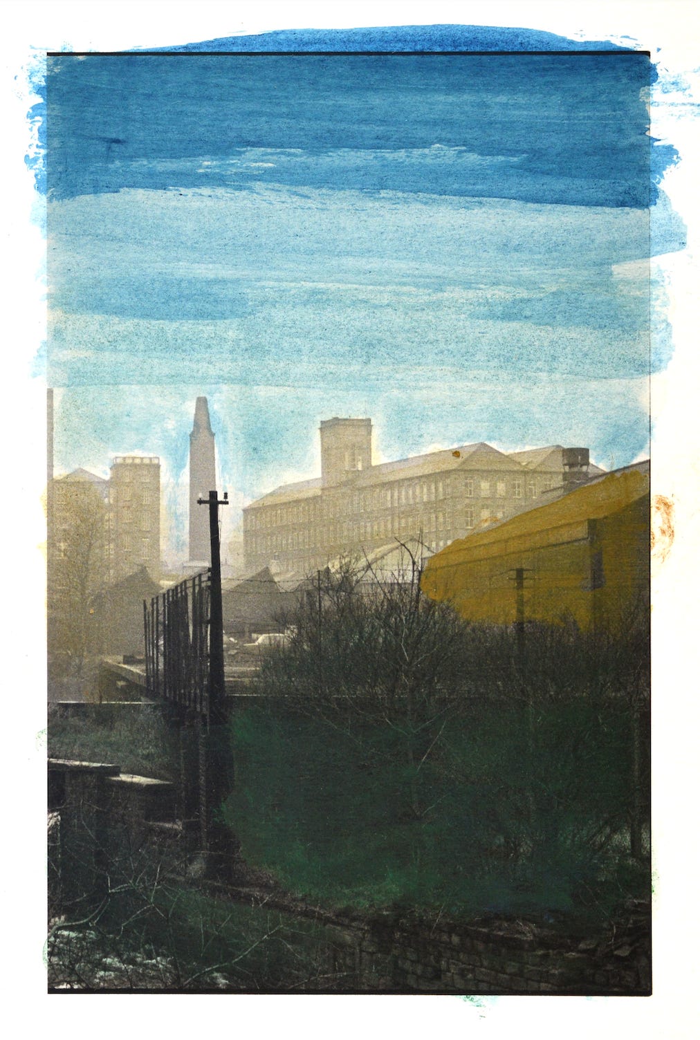
My first attempt at applying oil colour to a very absorbent paper. As you can see, it is a total mess, with streaks everywhere. The finished result looked more like a loose painting.
Well, that’s my article on hand colouring, I hope you found it interesting and are inspired to try it for yourself. If you would like to learn more about the technique then please book a one to one workshop with me.
Message me via Instagram @andrewsandersonphotography, or email; sandyjottings@icloud.com —————————————————————————————————————- If you find my articles informative or useful, please spread the word to anyone you can think of who would be interested.
If you have enjoyed this post and the information here and elsewhere on my Substack and you would like to support me, you can subscribe or just buy me a coffee at Ko-fi.com/andrewsandersonphotography You can send as little as £5.00, or more if you are feeling generous. This money goes towards materials used for the tests and printing for these articles. Alternatively you can be a paid subscriber.
Thank you for reading, please let me know your thoughts.
Andrew Sanderson April 2026.
Other places to see my work;
Instagram; http://instagram.com/andrewsandersonphotography
Original hand made darkroom prints are available from my online shop; www.andrewsandersonphotography.bigcartel.com
I also offer one to one workshops at my darkroom/studio in West Yorkshire, UK. If you are interested please email me at sandyjottings@icloud.com
ever notice that the fence posts in the top left corner of the picture with the "roller car" and the old man, spell "villa"? cheers oli
.. as an aged house painter showed me his tricks - I told him of mine - & not just barns & silos or warehouses. Have also ‘projected imagery at massive scale & scope - motion picture & stills - & re-shot as both - just as I shoot off this iPad or a TV screen. My only suggestion is ‘be fearless - when exploring ‘hand colouring’ ! And same re ‘Presentation ! Whether stills or motion picture
Love the saturation you get via dyes.. Have only worked with Marshall Oils & various markers etc & yes - ‘paper selection’ is critical - but I work with many types of Media including thermal prints & photocopied output etc.. & explore the idea of ‘Perceived Resolution a lot whether am 10 Generations or 3rd Gen from Original Source .. 🦎🏴☠️🍁