Expressive printing.
Scanning and inverting is not enough.

Following on from a post a couple of weeks ago about magic and mood in photography, this article is about the ways that I use expressive printing to subdue or emphasise different areas of an image to make the picture more powerful.
If you are a photographer who prints his/her negatives in a darkroom (and you probably are if you are interested in reading this), are you satisfied with the results that you get? I know that there is an enormous sense of satisfaction that comes from printing your own work in a darkroom whatever stage you are at, but do you look at the work of other printers and think; ‘Why do my prints not look as alive or dynamic as that?’ Assuming that you have a negative that is half decent in terms of exposure and strength of image, then you have the potential for a really good print.
Many film photographers have no access to a darkroom, so scan negatives then invert them in Photoshop. This obviously gives a positive black and white image (we are not concerning ourselves with colour film here), but does it give a good image? No it doesn’t. it gives you the information, but this is not enough. Having little or no control over the tonality of a shot produces lifeless, boring pictures. All of the classic photographers of the past manipulated their prints, even Ansel Adams dodged some areas and burned in others -despite his proclamation of the purity of the f64 ethos.
The following image is an inverted scan of an underexposed negative.
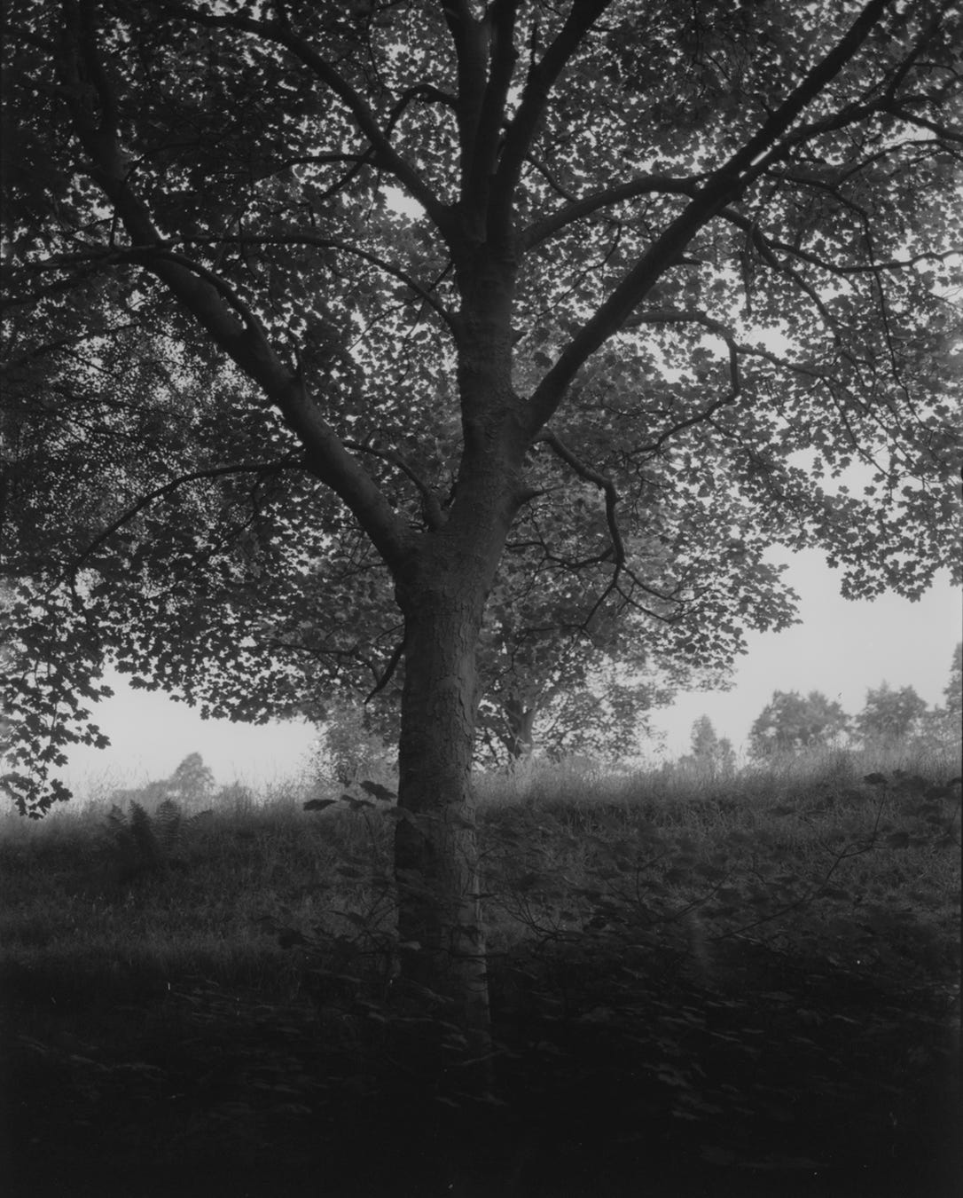
A rather dull, underexposed shot of a tree.
Of course it is possible, and quite easy, to burn and dodge in Photoshop, and the tools for that have symbols that come directly from darkroom practice. The thing is, I don't see much evidence of people doing that. As I say, most seem content with a pure positive version of the shot.
The difference it can make to a picture is huge, sometimes it only needs a little bit of work, and at other times a more dramatic approach is necessary. I obviously prefer darkroom methods and I am fortunate to have a dedicated space for mine. Scanning wasn’t an option for me until I had been a photographer for 27 years, so I had to learn how to print.
When I explored scanning and Photoshop I could see it had outstanding options for control, but I never liked the look of it. If I needed an image for a magazine article or my books, I made a 10x8 inch print and then put that on the flatbed scanner. This way I could get the image to look exactly how I wanted it.
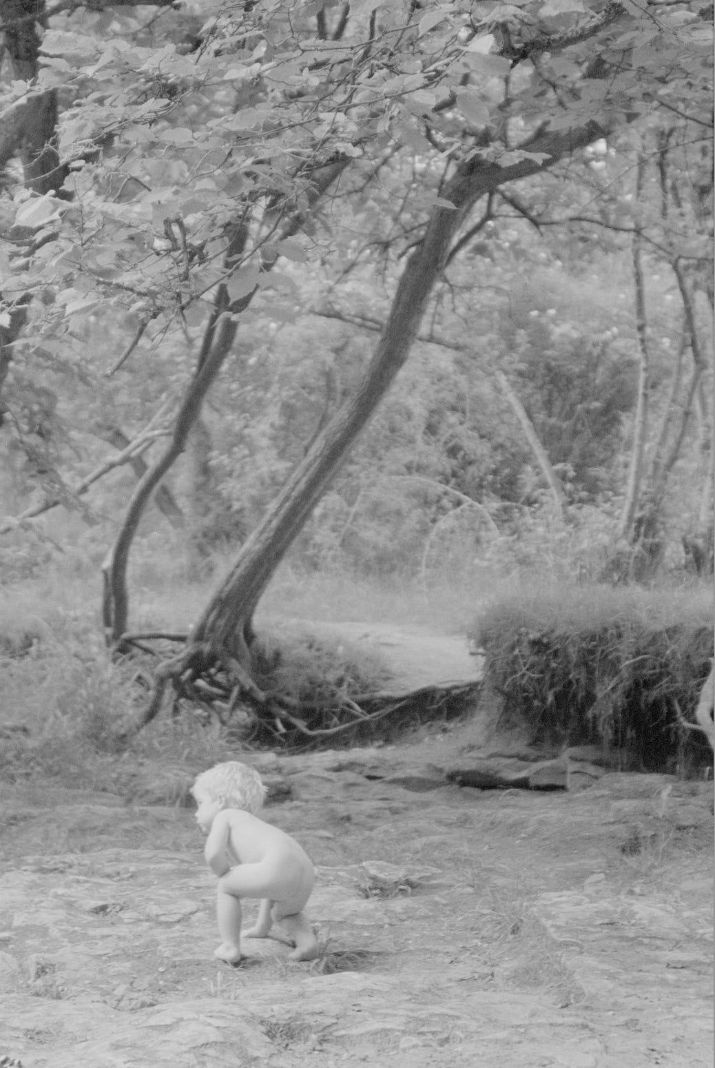
Inverted negative scan.
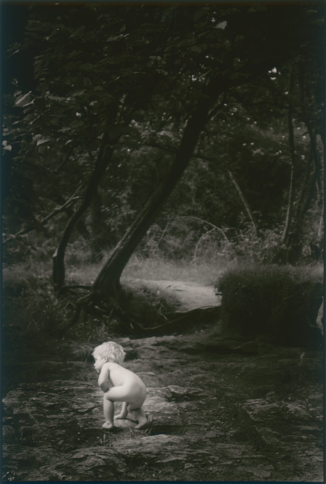
Darkroom print with selective burning in.
How to be ‘expressive’.
So, if we are agreed that dodging and burning are not only necessary, but an essential part of your ‘look’, then the question arises; ‘Which bits do you work on?’ You could approach this as just making sure that you bring out shadow detail and burn in highlight detail to the point where it looks as it did in your minds eye when you took the picture or the way you remember it. Printing to keep both ends of the tonal scale looking natural will produce a nice print, but this article is more about expressing a mood or a style and this won’t happen with a simple representation of everything that is on the negative. But what constitutes mood? Burned in skies can do it, but there is more to it than this.
Light creates mood, but lighting everything kills it. Light must be used to reveal or accentuate something, and to do that there must be other areas that are dark, the dark areas work by revealing their information only when the image is studied. So the thing that you want your viewers to notice in your print should be lit in some way, and the other areas should be darkened down. If you really want to understand light and composition, then study paintings. In a good painting there is nothing there that shouldn’t be there. Painters obviously have a massive advantage over us in this regard, because they are able to arrange elements to take advantage of the way our brain interprets the world. We have to choose the best viewpoint and pay careful attention to everything in the frame, if a painter has something in the scene that doesn’t suit the picture, it is simply omitted.
Dodging and burning in.
The way that mood is inferred in a darkroom print is through dodging and burning in. At the risk of kicking off a storm of protest from pedants, I need to say something;
If you are reading your test strips properly and making prints based on that, you should never have to dodge any area of the print. The only control you have is burning in. Now I know that statement will upset a few people, and if I said it on social media I would get a lot of people telling me I was wrong, but let me explain; If you do a test strip you should be looking for the shortest exposure that produces a black in the clear areas of the negative, this is your starting point. The highlights are controlled by correct filtration, and/or burning in. Okay, well if your blacks are produced by the shortest possible exposure, then dodging is only going to degrade those blacks. Does that make sense now? If you find that you are often trying to dodge out areas to reveal detail that you know is on the negative, then perhaps you should consider reading your test strips in a different way.
Many people choose a test strip exposure from the mid tone section because it looks the most like the tones they want in the print, but more attention needs to be paid to the shadow detail. If you have exposed and processed correctly, your negatives should print without trouble on a Grade 2. Look for the first appearance of black on the test strip and then check what the highlights look like at that exposure. If the highlights are correct you can go ahead with that print exposure to make a reference print. If you have no highlight detail, then you need to re test with a lower grade filter. If your highlights are grey you need to re test with a higher grade filter. When you have your filtration and exposure worked out, make a full reference print and spend a bit of time examining it.
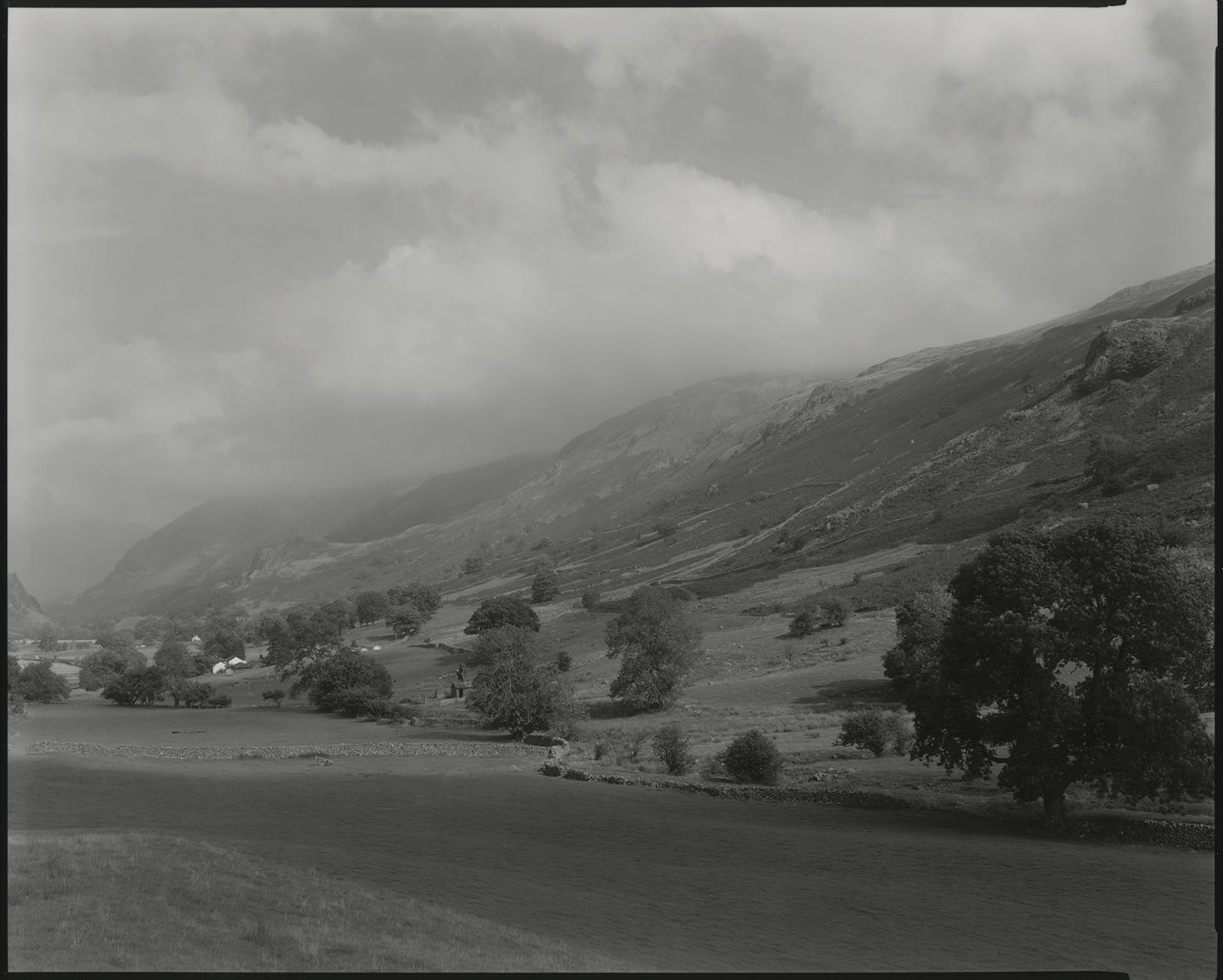
Thirlspot, North Yorkshire. Reference print.
Essentially, what you need to do is have a really good look at it. Give yourself ten or fifteen minutes to look all over the picture and really study it. The second stage to this is to decide which parts of the image are the most important, and which are distracting. When you have looked over the picture a number of times, you will find your eye being drawn to certain things again and again. Ask yourself; ‘Are these attention grabbing areas really the parts that I want my viewers to look at?’ Is there some element to the composition that I would prefer people to notice? This is where creative, expressive printing comes in. The bits that you want people to look at need to be emphasised and the bits that are distracting need to be subdued. How much you emphasise or subdue is totally down to you, but you will probably need to try out a few interpretations of the print to understand what is possible.
Thirlspot, North Yorkshire. Final print.
Judging how much tone to add.
I have seen examples of printing that indicate that some printers prefer chance to logic when it comes to establishing a burning in time. Burning in needn’t mean wasting 20 sheets to get one that works, as long as you approach it logically. If you need to burn a sky in, then do a test exposure in that area to determine how much exposure it needs. Just because you burned your sky in for ten seconds on your last printing session, doesn’t mean that it will need ten seconds this time. If you have an idea of how much darker you would like an area, then simply do a test strip in that area to find out what exposure it needs to get the tone you visualise.
If your first test strip doesn’t give you a dark enough tone, double your times for the next test, and double it again if you need a third test. Eventually you will find out how much time it needs to get the tone you require.
When I am burning in white skies or pale greys and taking them down to a mid tone, I generally work with the assumption that I need to double my base exposure in that area. I often use this as a starting point.
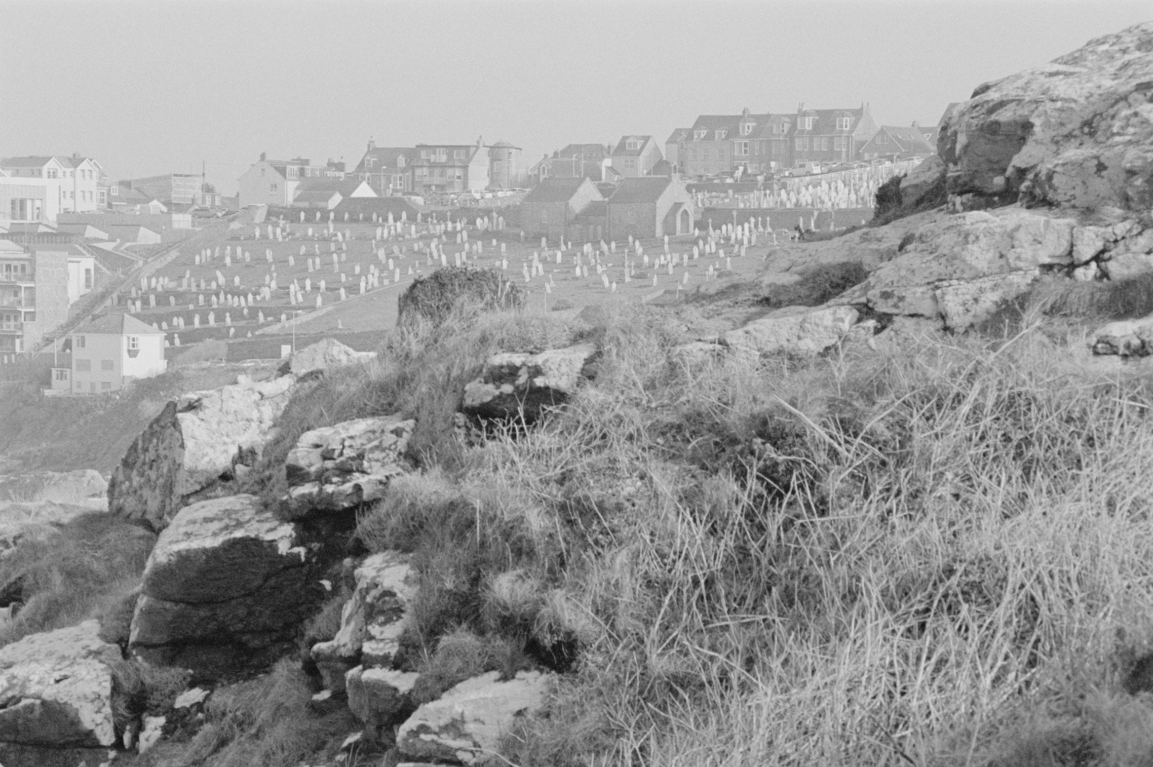
St Ives, Cornwall. Inverted scan.
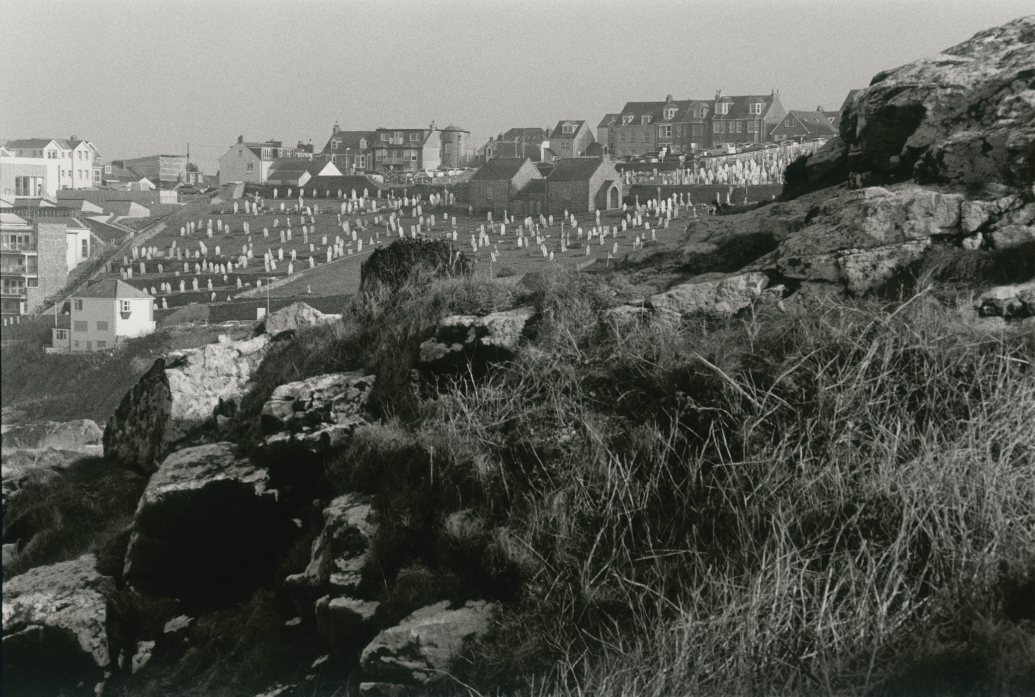
St Ives, Cornwall. Reference print.
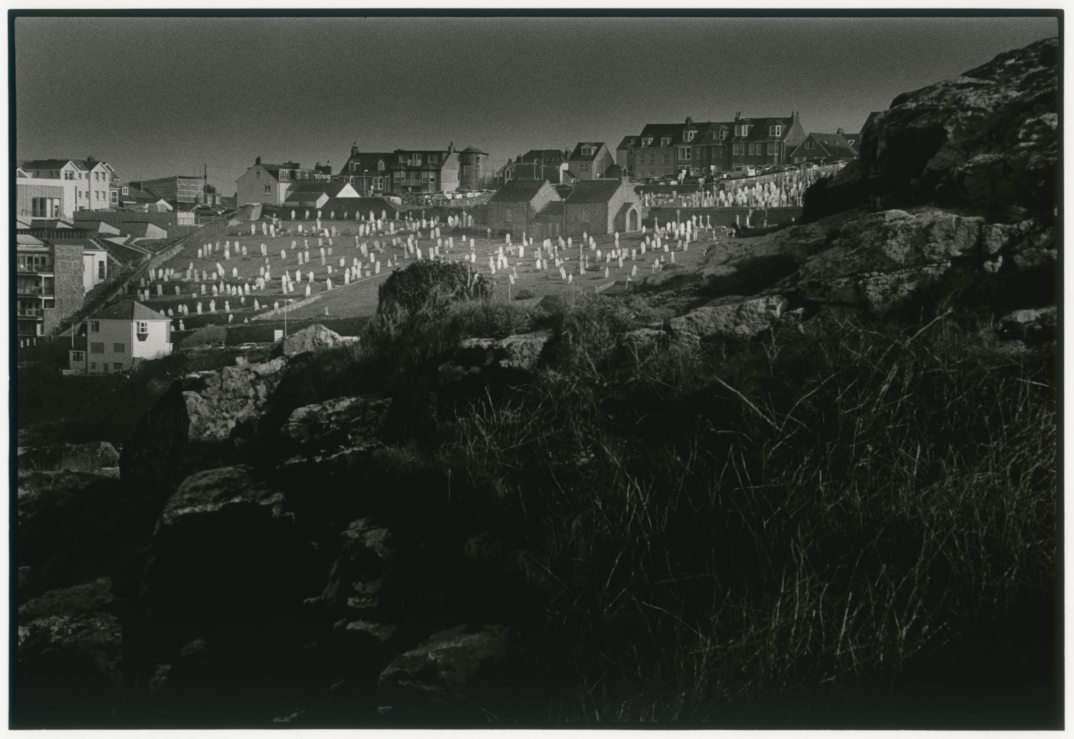
St Ives, Cornwall. Final print.
Another useful technique that you can employ to work out the areas that need to be darkened for the picture to work and to get some idea of how shading affects the image, is to make a few really small prints and then play around with shading using a grey felt pen. When you have decided which version works best, you can then begin to make it happen in the darkroom.
As I said before, start with a test to determine the correct time and filtration for a reference print, then test to find out the burning in times. Once these are decided upon, map out the different stages on an A4 sheet of paper, using a marker pen that is easy to see under safe lighting.
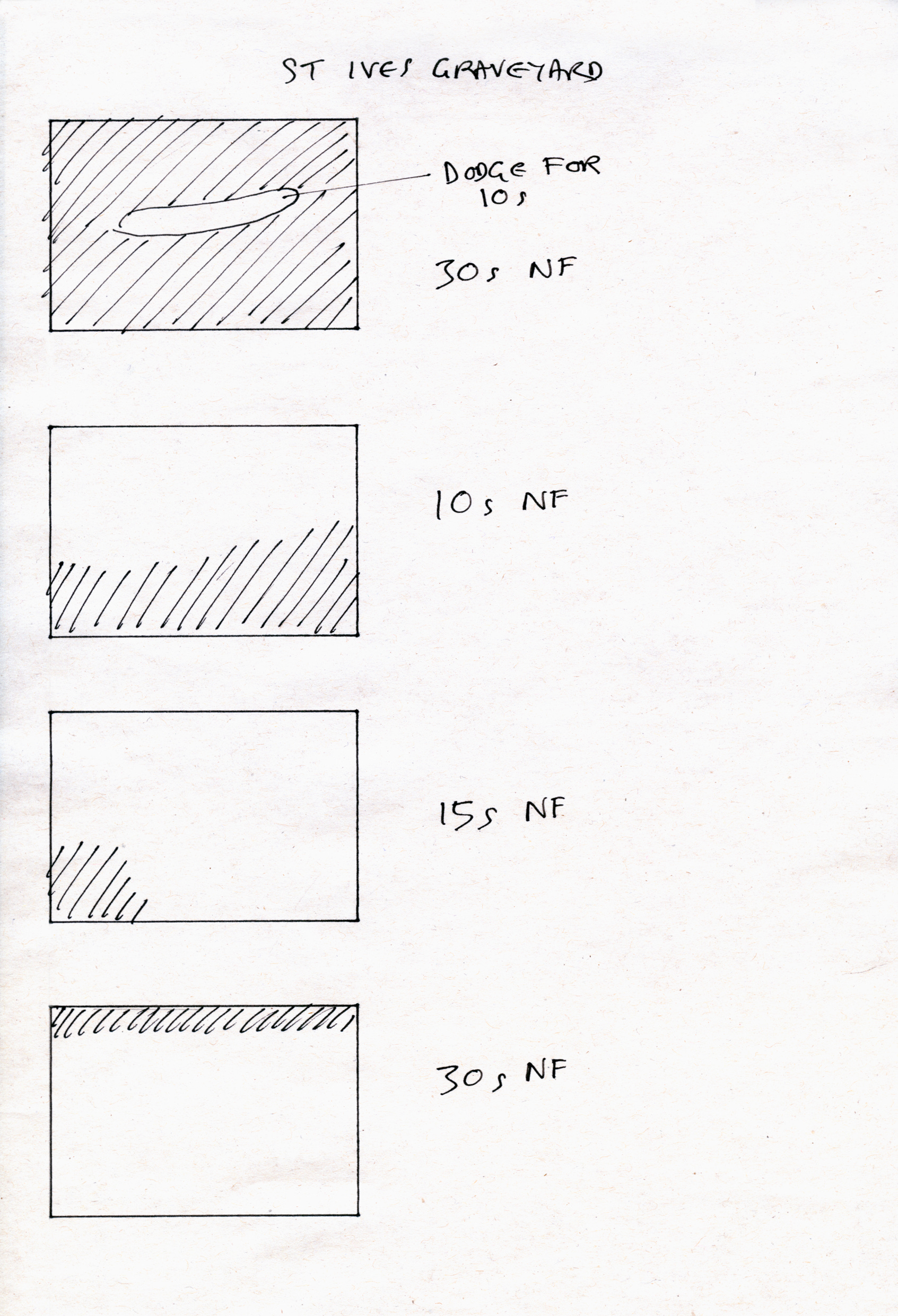
This is how I record my printing stages. The shaded areas represent where the print is exposed, 30s is my exposure time and N/F means no filtration was used.
There are many ways to be expressive in your work, I can’t give you a formula or a rule book, but I will reiterate what I have written so far, namely that to be expressive you need to have an idea what it is that you want to express. Look at your prints again and really think about which bits you think are important and which bits are distracting. To get your eye practiced at this you can also do it with any other photographs you look at, either in books, magazines or online. Look carefully and think about how they would be improved.
To be proficient in darkroom printing takes time and practice, but don’t be discouraged, it is very rewarding when you get it right. I often say that it took me twenty minutes to understand the principles behind darkroom printing, but it took me twenty years to learn how to print well.
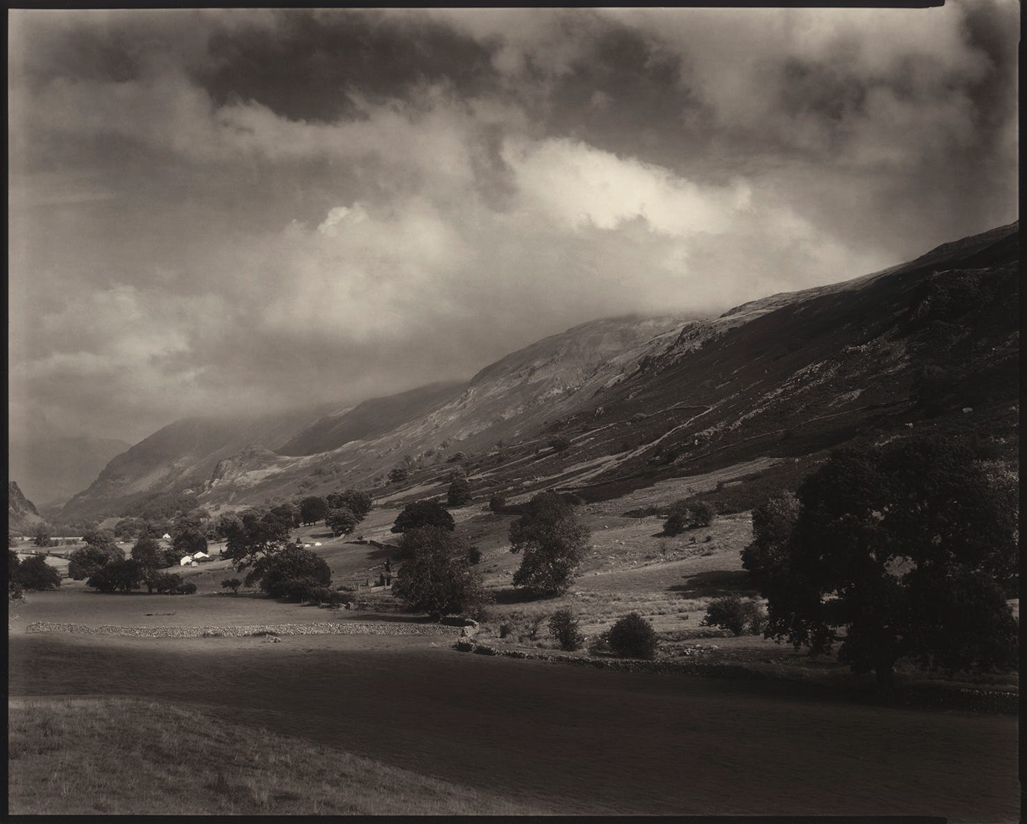
Appleby, Cumbria. 1982.
A very important aspect of darkroom printing is the paper you use. Don’t be tempted to buy cheap student quality papers, or out of date stuff that expired decades ago. Of course it is possible to print on these papers, but you won’t get a full range of tones from old paper. In almost every case, old paper will be much lower in contrast and you will not have deep blacks. Student quality paper has a lower silver content and this has a marked effect on how good the darker tones are separated, causing muddy shadow areas.
I hope this article has given you a few ideas, Expressive printing is exciting and once you have tried it you will see how it can transform an image.
Don’t let your idea of the final look be influenced by current ideas of what is acceptable, the things that photographers are supposed to do are totally thrown out 50 years after, and todays accepted norms will be too. The most important thing is to be true to yourself and produce prints that make you happy, then to get good enough at it to do it consistently.
If you find my articles interesting or useful, please spread the word to anyone you can think of who would be interested.
If you have enjoyed this post and the information here and elsewhere on my Substack and you would like to support me, you can subscribe or just buy me a coffee at Ko-fi.com/andrewsandersonphotography You can send as little as £3.00, or more if you are feeling generous. This money goes towards materials used for the tests and printing for these articles. Alternatively you can be a paid subscriber.
Thank you for reading, please let me know your thoughts.
Andrew Sanderson June 2025.
I have also heard the perspective of obtaining the shortest exposure for “detailed highlights” and then using filters for contrast/blacks. Have you ever compared these two methods? Maybe a follow-up post for this? Thanks for your insightful post.
Excellent article buddy.