Evaluating negatives.
How can you tell if your negatives are 'correct'?

When I am teaching my darkroom workshops I am often asked; ‘What does a good negative look like and how can I tell when I have got it right?’ The problem of knowing if the density and contrast of a negative is correct is something that seems to crop up rather regularly with photographers who are relatively new to film processing and there doesn’t seem to be much information available for the beginner, so I thought it would be worthwhile to write an article on this subject and to give some guidance on how to tell a good one from a bad one and to assess whether your negative is suffering from incorrect exposure or incorrect development (or possibly both).
I am not going to talk about this in overly scientific terms, as I am aiming this information at those who are fairly new to darkroom. Sometimes information can be off putting if it is too technical, so my aim is to put across how you should be thinking about this and how to visualise it. There will be no mention of sensitometry and densitometers, as that sort of information isn’t usually of interest to the person developing films in their kitchen sink, and densitometers are not readily available. The only way to judge it is to look at it as a negative and think about what it should be as a positive, but this takes experience, and as we all know; experience is something you get after you need it.
As a beginner, or even someone who has been doing it for a few years, it is still difficult to have a reference to judge your results against. You may see other people’s successful images online, in books, magazines and at exhibitions, and you may think that yours don’t match up to that, but bear in mind that you don’t know what their negatives look like. If you could see them, you might know what you were aiming at.
For instance, when you have the negative in your hand and you can see a pale image, but are not sure if that indicates under exposure or under development, where do you find the information? If you are confused about development and contrast, who do you ask? You could ask on a forum or a Facebook group, but it isn’t something that has an easy simple answer. Let’s see if I can explain what to look for.
Let us assume that you have processed a number of films already. Are you scanning these negatives, then manipulating them in photo editing software? Are you happy with your results? I think that it is probably worth mentioning that negatives you may have already scanned successfully may not be easy to print from if you make the move to darkroom. This is because a negative which is good for scanning can often be a bit too thin for darkroom printing. What do I mean by that? Well, if the scanned image can simply be inverted in photoshop to get a positive (this is also a feature on iPhones), this will usually not have enough shadow tone for darkroom printing. A negative that is good for darkroom printing will still scan well, so throughout this article I will be referring to negatives for printing.
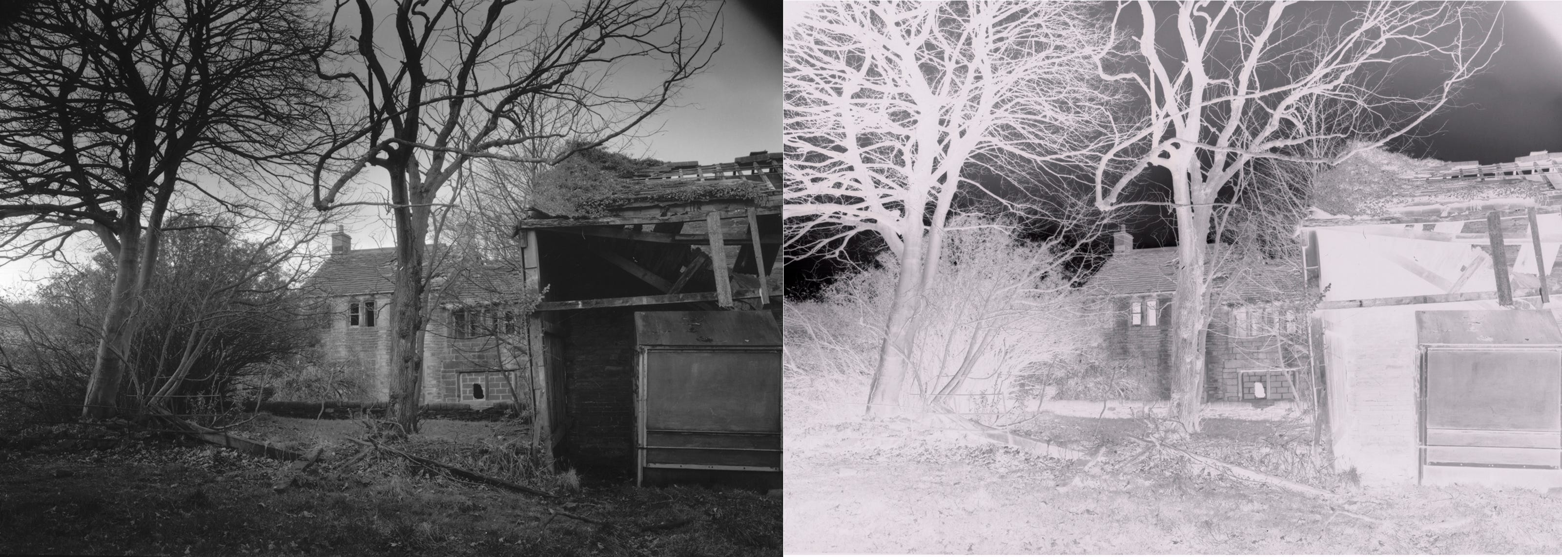
Two images side by side, one positive, one a direct inversion. If you point your phone at it and (assuming you can invert) and look at a negative version of it, you will see that the left and right images both look correct and are in an exact correlation with each other. This, you would assume is the perfect negative, but that is not really the case. If you are scanning and inverting you may find this density works, but if you are printing in the darkroom you will find that negative a too thin and it will print rather dark.
Ideally, for printing you need more shadow information, as the lower tones can easily be lost unless you are skilled at pulling out every last detail. Those new to printing seldom pay attention to the subtleties in the shadows and tend to expose the print for the midtones, creating a heavy print. With the added problem of prints looking darker after drying (known as drydown) this can create disappointing prints and severe loss of shadow detail.
I see many examples of images pulled out of underexposed negatives (After 46 years of darkroom printing I can look at a black and white photograph online and tell the quality of the original negative). Scanners and photo editing software are so good these days that a half decent image can be pulled out of negatives that would be considered a disaster by a darkroom printer. That is not to say that negatives for darkroom need to be fitted into a very narrow criteria of tonality and contrast. Negatives for printing can be a little bit either side of ‘ideal’ with the flexibility that Multigrade papers provide, but the nearer you can get to ideal, the easier your print will be and the more flexibility you will have for creative options.
Darkroom printing.
As I have already stated, a good darkroom negative will be the best for printing or scanning, so from here on I will refer only to darkroom.
Thin negatives are the main problem, the thinner they are the poorer your darkroom print will be. If there is no information on the negative it can’t magically appear on the print. That information gets there with exposure, but more on that later.
Modern Multigrade papers, with their range of contrast grades can compensate for slightly underdone (thin) negatives, normal, and overdone (dense) negatives. The ideal in most situations is a negative that prints on a grade 2. This will give you a better range of tones and an uncomplicated printing experience, so it is wise to aim for this as much as possible. If you are printing in a darkroom, what should you be looking for? You place a grade 2 filter in the enlarger and do a test strip, you then look for the first appearance of black in the areas that were clear parts of the film. When you look at the rest of the tones in that strip, do they look correct? If they do, you can do a full print at that time and all of the tones will fall into place. That is the ideal negative, but don’t worry if the one you are working with is slightly too dense or too thin. There will be variations, even within one roll of film because of differing scene brightnesses, but if your normally lit scene prints on a grade 2 you can be happy that your exposure and processing are in the goldilocks zone (just right).
What should you do if your negatives don’t print well on a grade 2? Lets start with thin negatives. If you do the test described above and the image is printed for the shortest possible time to get a black in the clear areas of the film, but the rest of the tones look dull and dark, you have a thin negative, lacking in contrast. The remedy? Print this negative on a higher grade (more contrasty) or develop your next film for longer. (try an extra 15% as a starting point).
If you have the opposite problem; and by that I mean that when your first test exposure to produce black is chosen, the rest of the image is too light, this means you have too much contrast and your next test needs to be done with a lower grade (lower contrast) filter with longer exposure times. With your next film, processing needs to be reduced by about 15%.
I will try to illustrate what the differences are here:
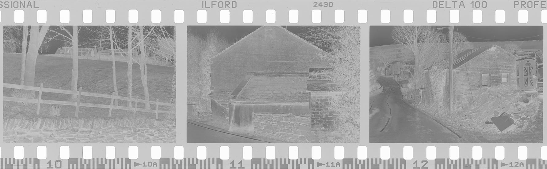
Under exposure is where the tones are lacking in density in the lighter end of the range on the negative (lower mid tones and shadows). Not enough light has reached those areas to leave any meaningful density. Highlights such as skies are usually visible, but not dense. Extreme underexposure brings totally blank mid tones and shadows. The edge numbers are denser here, showing that development is ok.
Under development looks different to under exposure, the numbers and letters along the edge of the film are affected by development, but not by your exposure. If your numbers look pale you have underdeveloped. The images will also be affected, giving negatives that look to have information in shadow, mid and highlights, but all of them pale. There has been enough exposure to put the information on the film, but not enough development to make those tones go dark enough.
To visualise what I am saying here, imagine what happens when an exposed sheet of paper is in a tray of developer (those of you with no darkroom experience will have seen this on films and TV). The paper is blank, then there is a pale image, then a grey image, then a darker image, followed shortly by an image with some areas of black where the greatest exposure had been. The same happens on the surface of the film when it is in the developing tank, the image gradually builds up, but is usually timed so that no areas go completely black because this would not allow any light through when printing. When no light can pass through, then these areas remain white on the print and we call this high contrast.
If the development is not long enough the heavily exposed areas of the film do not develop beyond pale grey (see picture 2). Therefore, underdevelopment of a film causes a loss of contrast and over development of a film causes an increase in contrast.
This is what you are looking for when you view your negatives. If you have ever read about the Zone system then you will have some understanding of what is happening.
Underexposure; Detail and tone in highlights, pale mid tones and empty shadows, numbers normal density.
Overexposure; Full shadows, dense mid tones and highlights, numbers normal density.
Underdevelopment; Thin density all over. Shadow mid and highlights all visible but pale, numbers pale.
Overdevelopment; Heavy density all over. Shadow mid and highlight all dark, numbers dense.
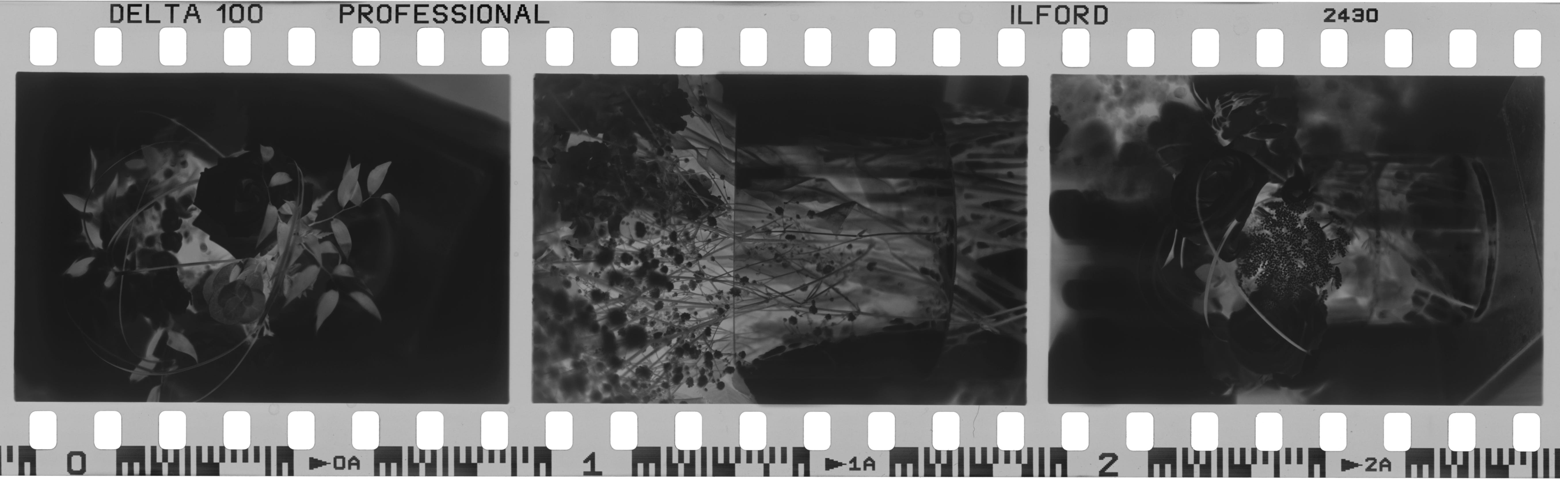
The following chart may make the situation clearer (apologies for the low resolution). Three pictures were taken; under exposed, normally exposed and over exposed. I did this three times, then under developed the first set of three, normally processed the second three and over developed the final three.
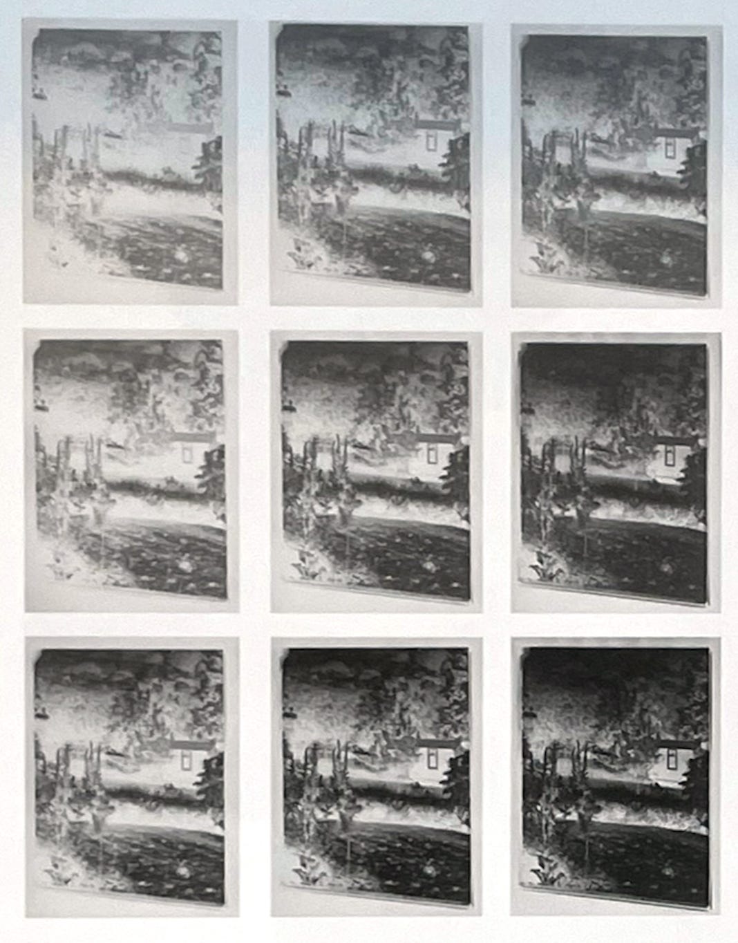
As you can see, the shadow detail is gone from the first shot, which was under exposed and under developed. At the other end of the scale with over exposure and over development the highlights have gone to black, which would make them difficult to print.
Viewing your negatives.
When I pull a film off the reel I never hold it up to a light, this gives an incorrect idea of the densities. I have an area of white wall which is lit by normal room lighting (I have a bare 100 watt bulb at about 6 ft away). I hold the film up a few feet from the wall so that I am not casting a shadow and look at the range of densities. I look at the edge markings and at a range of frames to get an idea of development and exposure. Judging correct exposure is easier if you are looking at a range of frames shot under different conditions. Judging a single sheet of large format film with no edge numbers is a bit more difficult, but not impossible if you apply a little logic and common sense.
Incorrect exposures can often happen when shooting on auto exposure. On a roll of film shot in different situations there will be frames where no sky is present, and others where it takes up a lot more area. If the camera was on auto exposure the amount of sky in the frame will affect the camera settings, even if the light remained the same throughout.
This leads me to an important point; judging correct density depends on what the image is of. A picture of a white rabbit sat on a load of coal will look like a dense blob in the middle of a thin negative, whereas a shot of a black cat in a snowy landscape will be the opposite; a clear patch in the middle of a dense negative. Both could be correct, assuming they were metered and exposed correctly. Each negative is totally different and seen side by side on a strip of film would look wrong, but both would print correctly.
When you look at your negatives see how much tone there is in the thin areas, usually referred to as ‘the shadows’ these areas might be the shadows underneath something, but may also appear on the negative if you are photographing a black car, a person in a dark suit, a black horse, or the entrance to a cave. Not all are shadows, but they are the darkest part of the scene.
Conversely, the brighter areas are known as 'the highlights’ but may mean any area of white in the scene, such as a white door, a wedding dress, a cloud etc. Looking at a thin negative then, you must assess wether it represents what you photographed. Looking at a thin negative of a cat for instance, your shot would be correct if it was a black cat on a coal heap, under done if it was a grey cat on grass, and severely under exposed if it was a white cat in the snow.
Another illustration might clarify this further; I hung up a black cloth background and taped a sheet of white paper to the left side. On the black part I placed a black camera and on the white part a white shell. I set up my large format camera so that I could get both objects in the frame at once and took an incident meter reading for the available light.
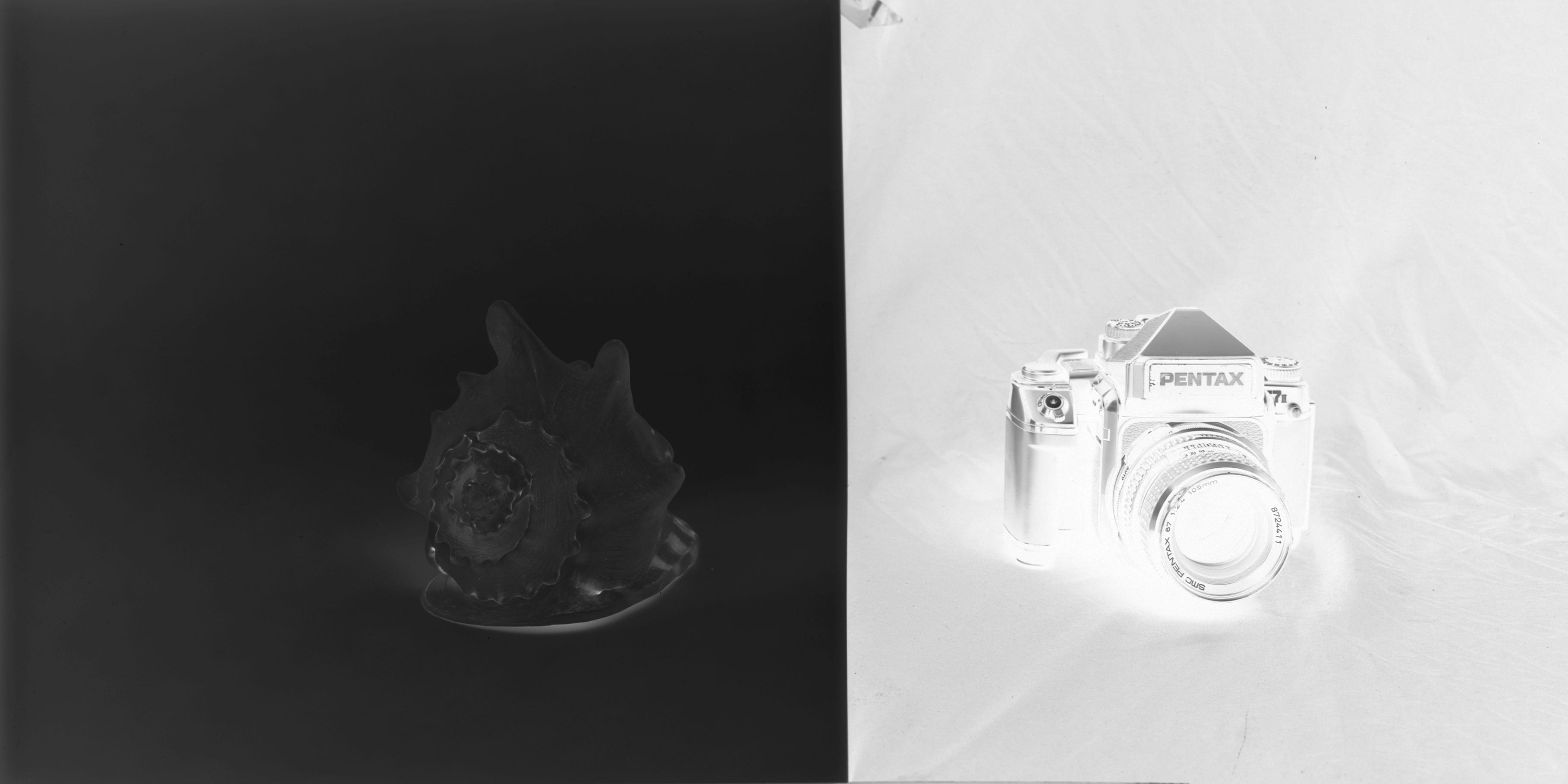
Looking at the negative it can be seen that one side looks dense and one side looks thin, there are hardly any mid tones anywhere in the image. The negative is correct because the dense areas represent the white parts of the scene and the thin areas represent the dark areas of the scene. If I cut the negative up the middle, then each separate negative looks wrong because the viewer has no reference for the other half of the tonal scale.
Another way to judge your negatives is to look at your mid tones. Grass is a mid tone unless it is dead and dried out, and on a negative should be on the healthy side of mid grey for printing purposes. Negatives for scanning can be a bit under and still produce decent images as I stated earlier, but too much underexposure will create problems, even with a scanning workflow.
If, when you look at your negative, you can remember how you metered the scene, then you will be able to judge your mid tones more easily. There are many ways to read the light in a scene and some people make it a much more complicated procedure than it needs to be. I will probably irritate a few zone system obsessives when I say that for most landscape shots it is sufficient to just point your light meter at a patch of grass.
So, to reiterate, grass is a mid tone and if you meter off it, rather than using auto exposure with sky included in the frame, you will certainly have a higher hit rate of good negs. In winter though, a snowy scene can easily fool auto exposure and a hand meter is a better option.
So what can we conclude from what I have written so far? well, if I was asked to distil the important information about judging negative density, I would have to say that the ability to visualise is the most important, indeed the ability to look at the tones of a negative and to mentally invert those tones and to ask the question ‘does this accurately represent the scene’? If you can practice this regularly your number of successful negatives will increase tremendously. learning to meter properly obviously plays a very important role here. I wrote a Substack article on this subject on the 17th of March.
Scanning.
As I said, scanning can produce an image from severely thin negatives, and the versatility of photo editing software will fool you into thinking your negatives are ok, even when they are way off the ideal, but if you have a negative that looks ok if it is simply inverted on your phone, you have an ideal negative for scanning.
Don’t be too hard on yourself if your negatives are not perfect, this is something you aim for as much as you can, but there are many things that can make it elusive. Unless you have a perfectly calibrated light meter, a fully serviced accurate camera, perfectly calibrated measuring vessels and thermometer, there will be variations from ‘ideal’. Add user error into the mix and the perfect negative becomes even more elusive. The road to being a better photographer is a long one and there are a lot of obstacles and pot holes along the way. Be observant, think logically and take control of ever stage of the process from visualisation to final print and you will produce great work. Hopefully this article will help you to identify your successes and failures quickly and easily.
Contact sheets.
For a better understanding of your negatives and as a way of assessing your most printable images, I would urge you to make proper contacts sheets off your negatives as you go along to get an accurate view of how the exposures look and how successful your processing has been. You must do this in the darkroom, not by scanning and printing out a sheet of ‘contacts’. These are not contact prints, the film has not been in contact with the paper, these are simply thumbnails.
Your contact sheet must be done at grade 2 for an accurate assessment of the tonality and density.
When you plan to make a contact sheet, begin with a test; Place a strip of paper on the baseboard with a representative strip of negatives on top. (Cover with glass or use a contact frame). Do a series of five second exposures and look at the processed strip. Look for the first appearance of black in the areas that are clear on the film, then look at how the other tones appear at this exposure. If you make your full contact sheet at this exposure will the images look pale or dense? if your exposure and processing are right the images will look correct. This contact sheet will be a valuable aid in assessing contrast and density, especially if you are not practiced at mentally inverting the tones of a negative.
Phew! that was rather a lot to take in, but I couldn’t see how I could shorten it and still put the correct information across. Thank you for reading this far.
Hopefully this article has given you something to think about, so perhaps you could go back and look at some previous negatives with this in mind. Is there a particular shot that has been difficult to print? Thinking about it with the above information might help you understand why. Good luck with your printing.
If you find my articles interesting or useful, please spread the word to anyone you can think of who would be interested.
If you have enjoyed this post and the information here and elsewhere on my Substack and you would like to support me, you can subscribe or just buy me a coffee at Ko-fi.com/andrewsandersonphotography You can send as little as £3.00, or more if you are feeling generous. This money goes towards materials used for the tests and printing for these articles. Alternatively you can be a paid subscriber.
Thank you for reading, please let me know your thoughts.
Andrew Sanderson August 2025.
@Andrew Sanderson, back in the late 90s, I shot all auto and turned my negatives over to a shop. In the mid-2000s, I bought a Nikon FE2 and started taking classes. 90 per cent of my rolls had one issue or another. Then I joined workshops, learned from my teachers and peers. I joined groups, built a darkroom in my home, made so many mistakes - inhaled a lot of chemicals, too. I look back now and feel so grateful for all that guidance but it took me YEARS to finally understand the negative and how to shoot FOR the negative. To get the guidance you offer here was not easy. Here, you have given new photographers gold in their hands. I hope they look back and know that.
Thank you Alv.